All right, iOS 26 finally out and of course I have it on my iPhone.
I downloaded it as soon as the update came out, because I'm genuinely so curious in what iOS 26 looks like.
There's been so many teasers and many reviews and open beta videos and I just genuinely thought the glass color looks cool.
So of course I thought what's the kind of book without a phone tour?
I downloaded the software my iphone and this will be the first time that i'll be seeing this and of course i'll be changing my phone layout and i might even make a wallpaper for this new ios os.
Ios, i os, all right.
First impressions of the os.
This is my first time opening it.
Okay whoa, all right.
So the first thing i noticed is, of course, the clock.
So it has this weird glass.
Look to it.
I think, if i remember correctly, you can change the uh size of it.
So customize.
If i go here, why can't i change it?
Hello Okay, it has to be a specific clock font.
There we go.
Okay, that is weird.
That is cool actually.
I think you can do this with Android already for like a long time already, but it's pretty cool.
It has this weird glass texture.
So if you move your phone around, it has this weird reflection as well.
Pretty cool.
That's pretty cool.
All right.
What else can we customize?
You can also customize.
We can choose a photo.
Yes, of course.
As far as I remember, you could also make this like a 3D wallpaper, if I remember.
So if I go to one other wallpaper that i have, let's say this one uh okay here, depth effect, so it's on right now.
So okay, i cannot tell the difference.
All right anyway, let's move on to the home screen.
Okay okay whoa, okay.
So whoa that, wow.
Look at the icons.
They're definitely new, they're definitely new.
They're definitely new.
Still not minimalist like I want it to be, but that's fine.
Life doesn't go our way sometimes.
So definitely the new icons are newer.
They're more glassy and it's now opaque.
Oh yeah, it is.
It's like a diffusion of the background as well.
That's pretty cool.
So yeah, these are new icons.
I think we can change the color of them as well.
We can make them glass i, if i remember correctly, even though i have a memory of goldfish.
Um, the widgets are also different now, so it has a opaque-ish look to it.
It also has more rounded corners as well.
How about the notification center?
Whoa okay, that is cool.
That is really cool.
So You'll notice that it has a transparent glassy, liquid looking thing.
I will never, wow, that's actually very trippy.
I will never get sick of looking at that.
Okay, that's pretty cool.
That's pretty, pretty cool.
All right, wow, okay.
Oh, yeah, and then I noticed there are widgets as well on the notification center.
That's new.
How about camera?
I know camera is different as well.
Uh okay, oh okay.
So the camera is much more minimalist now and has this cool like switcheroo thing.
Uh, definitely much more cleaner camera this time.
Uh, i like it actually when i put this one.
Okay, these are the settings, so i do have to click here now instead of somewhere down there.
So, pretty cool.
Oh, i can just swipe up as well.
Okay, that's oh.
Okay, that's pretty, pretty interesting.
All right, so far I'm liking this, but the main thing that I want to see is the customization.
So if I hold this, even the edit buttons are glass.
If I edit, customize, okay.
All right, that's what I'm looking for, the customize icon.
So, all right, let's click clear and see what it looks like.
Oh, whoa.
Okay.
Okay.
Whoa.
I mean, it's still like the tinted one that Apple offers.
It's just glassier, I guess.
Let me open customization again and change it to a dark tint.
Okay.
Wow.
Okay.
Whoa.
Whoa.
Whoa.
Okay.
Wait, wait, wait, wait, let me cook.
Holy shit.
Look at that.
It's okay.
They're all glass as well.
Wait, this is actually really nice.
Holy shit.
Like the glass tint is actually my jam.
What the heck?
Okay, wow, okay, that's actually pretty nice to look at, if I'm being honest.
Okay, as much as I still want minimalist icons, this is pretty nice to look at.
I think I just have the wallpaper idea for this.
So if you take notes like I do, then you probably already know that I've been using a textured screen protector for my iPad for a while now.
Having that paper-like feel when I write is really, really important to me, which is why I'm excited to say that this part of the video is sponsored by Paperlike.
For those who don't know, Paperlike 21 is essentially a screen protector for your iPad that emulates the feeling of writing on premium paper.
So when you're using it with an Apple Pencil, it genuinely feels like writing on paper.
I'm gonna be real.
I've been using Paperlike screen protectors as my screen protector for a couple years now and honestly, I don't know if I can go back to writing without it.
The paper texture is just really nice to write on, so whenever I take notes or I write mind maps, it's always great to use the Paperlike screen protectors.
It's also made with proprietary NanoDot technology, which not only gives it that paper-like feel, but also reduces wear and tear on your Apple Pencil tip, making it last three times longer compared to other screen protectors.
It also has an anti-glare finish, which is really, really helpful.
If you want to check out Paperlike, there's a link in the description below.
I genuinely recommend them.
I've been using them for years now, and it's been great.
Anyway, back to the video.
Okay, what do I think of the overall UI?
I think it is great.
They've well executed this, even though this is already a concept by Windows.
It's kind of a meme at this point that Apple's always late to the party.
And now they're hopping on the translucent glass style train, even though Windows have already done it.
But nonetheless it actually done it very well and i'm really, really happy with how it turned out.
I'm curious to see if this will last for a long time, because there are definitely times where the ui especially if you have a glass background on text that it could be kind of hard to read at times.
So there is that.
But i don't really use my phone for reading, if anything, i just use it for calls messenger, occasional gaming with my friends, because I have some games on my phone.
But anyway, I'm currently in my desk in my studio and I have my computer on because I have an idea for a wallpaper that would match this UI perfectly.
So let me just prop you up on the table.
So once I'm done making the wallpaper, I will do a proper what's on my phone.
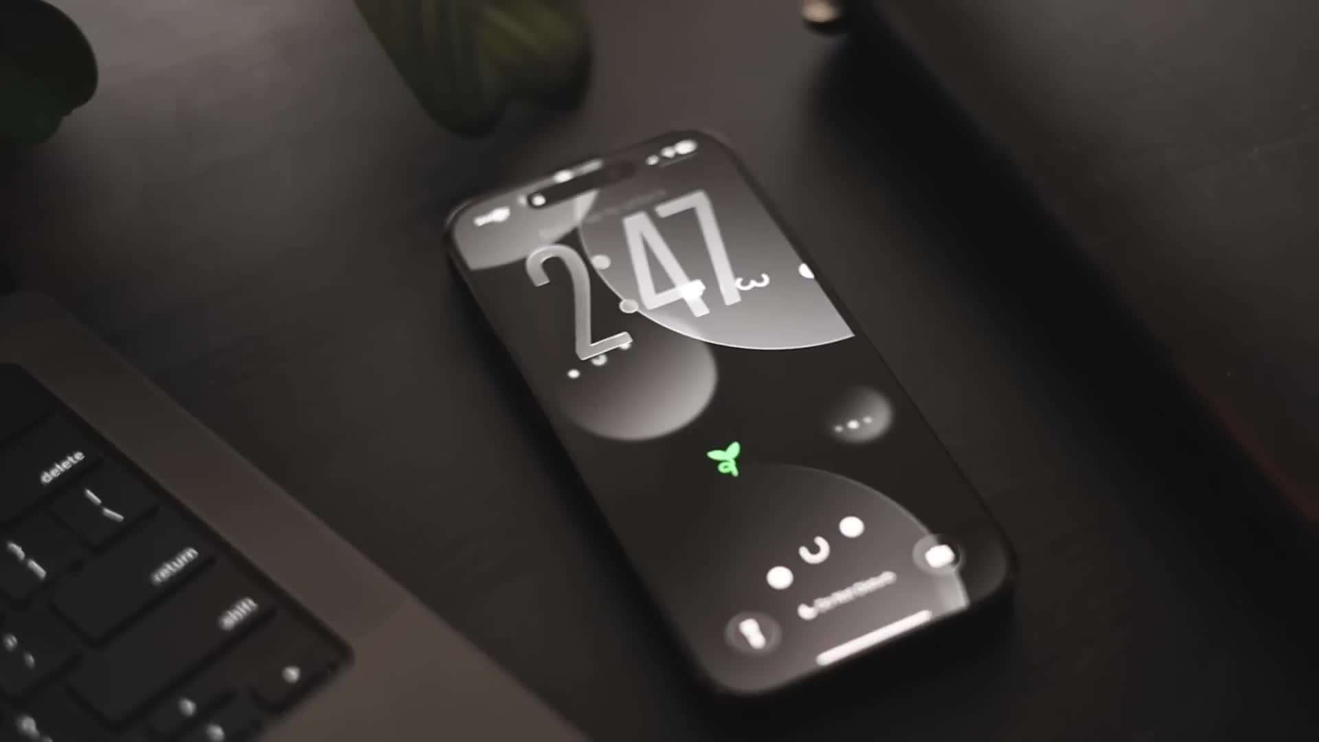
All right, so it is 40 minutes later and for the wallpaper i wanted to go for a glass core sort of look, without really deviating from the kind of book brand, because i've always loved doodles, like the cute little faces.
So i wanted to keep that theme as well as you know, the kind of book brand of having the leaf, but integrating that to a sort of glassy look.
Here i made this texture looking glass with a specific outline, as well as his gradient, as well as his opacity, making this look like a frosted glass effect.
And I also made these other ones, and I made them blurred with Gaussian blur, basically to make it look like it's a 3D sort of look to it.
And finally, I just added like a little leaf over here.
So to make it coherent to the kind of book brand, so.
Yeah, I'm going to be exporting this.
I'm still yet to make a light mode version of this, but it's just easy.
I just have to change a bit of parameters and colors.
But yeah, I'm going to export this, airdrop it to my phone, and let's see how it looks.
Alright, so this is what the final setup looks like.
I made the wallpaper with the glass theme and I think it really fits very well.
And, as you can see, I made the clock a lot bigger as well, just to you know fit with everyone else and not have a unique personality of my own.
Not much here on the lock screen, so let's get into the home screen.
And here we have my main home screen with the widgets.
So of course, with the theme, I went for a dark glass customization for my icons and everything.
And it just really matches my wallpaper that I made, which I'm really, really proud of.
Now I have to admit, with this change it is a bit harder to tell the difference between different apps, because they are on the same color.
It's not really a big deal since I'm trying to not use my phone in the first place.
So yeah, I just really like how it looks.
And with this update, everything literally looks like liquid glass, which is really really cool, especially this notification center, which I will honestly never get sick of.
Like, this looks really freaking sick.
Even just scrolling through, like, my app library is just really, really mesmerizing.
Although, maybe I'll get bored of it in, like, after a couple weeks.
Who knows?
Alright, the first widget we have here is the batteries for my Bluetooth devices.
Now, I only have this because I always forget to charge my earphones and it's always a slow battery.
So, I put this here because now I know when I have to charge my earphones.
God damn it.
Next widget we have is my Google Calendar.
Now, I always have this.
This is very important because I need to keep track of what's happening in my day.
And just to have a widget to tell me what is coming up next is very, very useful, especially in school.
I would highly recommend if you're a student or if you're a living person, just have a calendar widget on your phone.
It's very useful.
Next we have is my Heavy.
So this is my workout tracker app.
And yes, as you can see, I've only worked out once this month.
I had a wisdom tooth extract.
Next, on the right we have is Duolingo, so I just find this a really fun activity to do to learn a bit of Chinese, Spanish and all that instead of just scrolling away throughout my time and yeah.
And finally, the apps on the dock here, or I don't know I still don't know what you call this, but anyway my YouTube Studio app, which is to track my YouTube analytics, Strava and Heavy for my workouts and runs, and Messenger, because this is the main app that I use to communicate with my friends and family.
But yeah, that's pretty much it for iOS 26 and my phone tour.
I wanted to keep this much more sweet and simple because I didn't want to bombard you with just random apps and widgets.
I just wanted to show you the general look of my phone now with this new update.
Anyway, I hope you guys enjoyed today's video.
And comment an apple emoji.
Like literally, comment an apple emoji if you reached this point.
Anyway, I'll see you guys in the next video.
Don't forget to drink your water.
Bye!