Today, we're joined by Jorn van Dijk, the CEO and co-founder of Framer, the leading website design platform.
Jorn is going to use his expert design background to review a bunch of user-submitted websites that were built using Framer.
Welcome to another episode of Design Review.
Welcome, Jorn.
Thank you.
Thank you for having me.
Yeah.
Thanks so much for joining.
Awesome.
Well, let's jump into some website reviews.
All right.
First up, we have Lumari.
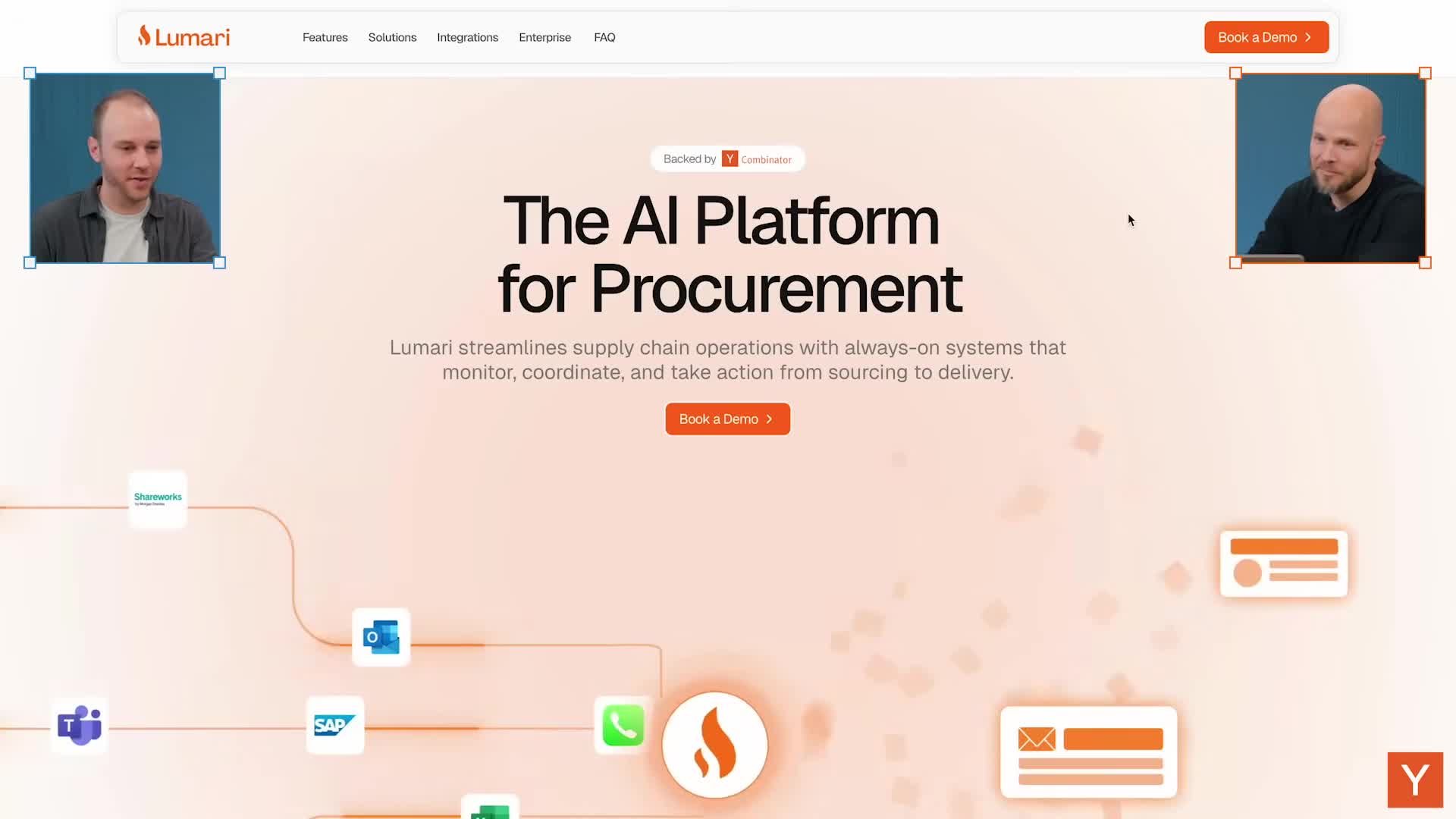
So the AI platform for procurement.
Lumari streamlines supply chain operations with always-on systems that monitor, coordinate and take action from sourcing to delivery.
I guess my first reaction is there's a lot going on here.
There's a lot of movement, a lot of icons coming in and being spit out.
The AI platform for procurement, that's clear enough what it is.
I don't have an immediate need, I think, for this solution.
But yeah, the animations, I probably also toned that down a little bit.
It's cool that it animates, but it's a lot.
There's a lot going on.
Two book, a demo buttons.
So good call to action, but because there's also a lot of orange on the page, I feel like the buttons kind of get lost.
They sort of blend into all the other orange that's going on here.
Yeah, I'd agree with that.
Maybe try black or try one CTA, one large one, and then use the other space.
I also think that book a demo button.
I don't know if the conversion on that generic sort of CTA never that great.
Imagine that I'm coming to this website for the very first time.
You probably first need to convince me what this is and what it's about before I will do something as dramatic as booking a demo, which is taking my time.
And now I need to be on a call with a person for 20 minutes.
I feel like there's a lot of these graphics that are kind of like vague, generic graphics.
And I'm missing something real that can help anchor like, what is this?
What does the product look like?
What do I use it for?
Yeah, I would agree with that.
Probably screenshots would help.
Video walkthrough could also help.
It is a bit high level in speaking about the value proposition.
And maybe those two things can make it a bit clearer what we're looking at exactly.
We're i don't know, probably three quarters of the way down the page at this point, and now we're getting into some specific things like a unified supplier inbox po tracking, change management.
Those are some, i think, tangible things that i can imagine how that works and what somebody would use this for.
Okay, so there's a lot of things in here.
I think one of the things with these tabs is most people will never click on these.
So you have to assume that anything that is behind these tabs, people will never see.
Yep.
There's a cool trick where you can connect that to the scrolling behavior.
So as you scroll the page, it goes from procurement operations to supplier collaboration.
So you're gonna like take the user by the hand and show them the context or the content of those tabs.
But I think this section could be better if those were screenshots of the product, because that's still pretty generic.
Um, you know, i i don't really know this this card is not good and then the other one is good.
That's kind of what the illustration is hinting at.
Is this a delete thing to delete this card and this one is to accept this one?
Yeah.
So it's a bit abstract what's going on and a screenshot of the product could maybe solve that.
Yeah.
Okay.
So integrates with all your tools.
So you know, if I have a supply chain business and I use all these other tools, this kind of gives me confidence that I can use it with all of these.
The way those logos animate in and out it's called ticker effect which you can use in Framer.
Let's set that to 02 and then, on hover, you can make it move by half uh, half speed.
So it's a cool effect.
Where i think this is going way too fast yeah, so slow that down and then, on hover, make it so that you can click on it and see something uh about that, uh about this feature, yeah.
So here you probably want to see how does it integrate with drive?
Is that a, Is that a two-click action, or do I have to install some plugin?
But give the user some context on that.
How do you feel about the thing where when you scroll, things animate onto the page?
It depends on how it's done.
I've seen many examples where that's done very tastefully and it feels very natural, but it's hard to get that right.
So animation, I feel in general, is like pretty challenging to do well because it can be distracting very fast.
If you're making the animation and it's your first time, then always ask someone that has a little bit of experience like what would you improve here?
Because it's easy to go.
It's very easy to go overboard with transitions.
Yeah.
What are the best use cases for animation?
Like, when would you recommend that people use that?
Drawing attention to something that's probably the number one um, and and making something like overly uh um, obvious.
So I think in the header here, like what they're trying to communicate, um can be done, can be made very clear with animation, but this needs a little bit of work.
The thing that I think works is okay.
So sources from the left are going through Lumari and then something happens on the right, but that something is extremely vague.
It's just spitting out some cards with envelopes and phone calls.
Yeah.
So if I'm talking through it, I actually might understand what it's trying to do, especially now that we've read the rest of the website.
But a new visitor that we were just three minutes ago will not spend that much time looking at this animation.
So you need to simplify things much more and make it extremely obvious for it to really work.
Yeah, you got to kind of like beat people over the head with the thing that you're trying to communicate, right?
And make it super, super obvious.
And then okay, so we get to the bottom and we had a bunch of FAQ stuff ready to bring AI to your supply chain.
Yeah, I think the last part of the site here is a bit generic.
I think it's an okay website, but there's a lot of work to be done in the details and really nailing this and then especially on the animation front.
If you had to give one piece of feedback, that's going to be the highest leverage thing, to most improve this what do you think that would be?
Well, show the product.
That'd be number one.
I'm not going to book a demo without getting just a little bit of a taste of what the product looks like and how it works.
So either just a screenshot or a collection of screenshots or a short two-minute video walkthrough.
I think that book a demo button should be show me video walkthrough or show what the product looks like to give people a really clear understanding of what Lumari will achieve, so that I can then maybe book a demo.
Yeah, it makes the product more real.
I don't know if there's a real product here or if this is just a site they put together really quickly with Framer.
And so any evidence that this is real and, you know, they say that it's trusted by these people.
So I presume there's a product and people are using it, which is helpful.
But yeah, I think my biggest thing is like Visually, a lot of these illustrations look nice and they fit a common theme and brand that they have going on, but they don't communicate information to me and they don't help me understand the product or what it actually does.
And so that I think is the biggest area of improvement for me.
Awesome.
Thank you, Lumari.
Okay.
Next up, we've got Alai.
Create high quality presentations with AI.
Okay.
So we got a lot of animation happening with this one too.
I guess one thing that's different here is I feel like I'm seeing parts of the product.
And it's clicking around to different templated slides, maybe.
Okay.
So I think what we're seeing here is this is some type of like PowerPoint, Google Slides type thing that makes it easier to edit templates, design slides, move content around.
Looks like it's got layout positioning, which most slide products do not have.
That seems pretty cool.
Yeah.
I mean, I do think by looking at this hero I have a general understanding of what this product could do.
I don't know if the simplification of the product's really helpful, right?
This is not what the product looks like.
They're taking parts of how it works and showing that in this video.
So it's a bit you kind of have to piece together.
What you just did is like oh, it's doing something with themes.
It's doing something with layouts without showing me the actual product itself.
Yeah.
I do really like that bar at the top.
Upgrade to pro and get a free 30 minute session to perfect your deck.
Okay.
So that one's positioning it for making decks and then this one and the tagline is positioning it to create high quality presentations.
Yeah, I find this kind of rainbow background a little distracting.
It's not fully a container around what's happening here yeah, and so i think that made it uh, made it harder for me to orient around what was happening.
Yeah, with the, the animation that's happening here um, all right, let's see what else we got here.
All right.
Number two product of the day on product hunt just used it.
Totally crazy, switching from gamma to a lie.
Gamma's been in the news with a large fundraise and things seem to be going well for them.
So it's clear they're trying to counter position themselves against Gamma here.
We've got a lot of quotes.
How do you feel about some of these quotes?
Are these the type of thing that resonate with you, especially even as you're thinking about the Framer product and site?
I think if you scroll up a little bit, I think if I read a headline like create high quality presentations, Typically you need to back that up right.
You can't really say that about yourself unless you have some proof that people think that these presentations are high quality.
Um, so I think that positioning wise on the page that kind of works, that they uh put it below the fold.
I don't know if the, if the quotes are really speaking to the quality of the presentations.
They seem to be a bit more generic.
So.
Yeah, I think one of the other things that resonates with me is they've got a headline here which is clear, but there's maybe a missed opportunity for like a sub headline or something that explains literally what this is.
And we spent the time to follow this and try to piece together.
And we went through, I don't know, three or four iterations of this animation.
And I think we figured it out after that.
But they could have just told us up front and that would have saved us a bunch of time.
Yeah, and most users won't spend that time.
The hard challenge is like you really have to make it obvious in five to 10 seconds.
And I think 10 seconds is a long time for people to try and figure out if this is for them.
It's also not obvious here, like they said, presentations but, like this, could be webs, like sections on a website or something too.
So going deeper could be good there.
Okay uh, never start from scratch again.
Focus on your idea, not tweaking pixels.
Ai has all the context.
You have the control Okay.
So this is a variation on a tabbed concept where they've got a timer for each section to make it easy for people to see all of them.
Can you click on the sections?
Yeah.
Okay.
Well, I mean, this is implemented quite nicely.
Yeah.
Yeah, that's good.
I like the big text here. a lot of times when people make tabs there's like little tiny text or something and it's real easy to miss um but i like that that it's really big and it draw my attention and i read all of those headlines yeah i'm not sure that it communicates specific things about the product.
Like, I don't think that I read those and then have a better understanding.
They're still kind of like marketing speak.
You know, like never start from scratch again, focus on your idea, not tweaking pixels.
AI has all the context, you have control.
It's like, I need the like literal thing to help me understand what I can do with the product.
And I still haven't gotten that yet.
It's a bit generic.
I mean, this honestly sounds better.
The sub headlines here.
Yeah, the sub lines are more explanatory than the headline and then they disappear.
So you have like five seconds until the timer's up and then it goes away, which makes it difficult to to read.
But these seem to be the sub headlines here seem to be the most uh, compelling explanatory thing for helping me understand what's going on.
Um presentations create okay, so here's some examples.
I guess is what we're seeing here.
I mean, this is good.
Yeah, it's giving me an example of of um, of what type of output that I can expect.
I think one thing that's hard, it depends on the audience.
But if you're making a claim that something's really high quality, then your your benchmark for what is high quality is different than mine, is different than everyone in the room.
So if you're saying high quality, then this needs to be high quality, right?
Like by for everyone standard yeah, and so the output that i'm seeing this um generate is looks.
It looks good, but it's also it's pretty generic right, i think, this type of output, it feels a bit templated.
So I think maybe the positioning of this product could more be about speed and ease of use if that's what they're going for with AI and less so about, you know, positioning it as like a premium, you know, most high quality solution.
And that's sometimes hard to get right.
Like trying to be honest about what the value proposition of your product is versus the things that you also want it to be.
Yeah, these do have like similar formats, but with different skins applied is what I'm seeing here.
Try for free.
So that's good.
It's a good call to action down there.
Are you compelled to try it?
Yeah, I think if I wanted to make some presentations and I could just click this try for free button, I think I probably would.
Uh, but this is a missed opportunity forced me to sign up.
I think it'd be even cooler if I could try it.
And then when I wanted to export it or you know, get a share link or something like that, then it forced me to to sign in.
So I'm already committed.
Yeah.
Yeah, maybe this is a good product to just have the prompt bar on the front page.
Just let me type in, I want to make a presentation about Y Combinator, see what it generates.
Yeah, I think one of the biggest things is you want people to get to the aha moment.
How can you get somebody to experience the value of the product as quickly as possible?
And this is like the biggest blocker you could possibly put up is just log in or create an account.
Yeah.
If you can let people try the product first or even in some demo modes, it's probably good.
Yeah.
I think one of the tricky things also is, especially for a product like this, like you're competing against Google Slides yeah, you know which is free and everyone has access to, and they've probably already messed around with, and so trying to get people in as quickly as possible, i think is actually really important making it really frictionless, because you're competing against a lot of free stuff also.
Awesome cool, thank you, eli.
Next up, we've got juicebox.
Now this looks cool.
Win the talent war.
Fusebox is the AI recruiting platform that understands who you're looking for.
Level up your team with search CRM and agents.
The things that jump out to me is like they have a pretty distinct, unique style going for it.
And it's something that I immediately noticed from the tiny purple button that says new tri-juice box agents to that sort of corner flap situation.
Can't do anything with it.
But it's pretty clear that someone's, you know, been looking at the details of what this looks like.
If it's an aesthetic that you're excited about or not, that depends on your own taste.
But yeah, I think this looks pretty interesting.
Yeah.
If I understand what it's for, win the talent war, use books.
AI recruiting platform.
Yeah.
Okay.
This understands what you're looking for.
So they're saying we will help you find really high quality people based on some inputs, I guess.
Yeah.
Yeah.
That's my guess as well.
I like this headline, win the talent war.
It gets your attention and I think it also speaks to the people that feel like they're in a talent war, you know, trying to find the best people to come to their company.
Got a bunch of logos, recognizable companies, which is really cool.
Got Cursor, Quora, Perplexity. a lot of these seem like very um like modern uh ai era companies too which is cool it's not like a bunch of big dinosaurs it's it's kind of communicating to me that um modern companies on the cutting edge with ai are using juicebox to help recruit and this is cool let's try it Try it out.
Okay.
Who are you looking to hire?
Ooh, a AI forward video marketer or the framer design team, just because we were talking about that just now.
Getting hit by the... Are you compelled to sign up?
I mean, now I would probably go back and see what the product looks like first.
Okay.
So you'd hit the back button here.
Yeah.
What are the things you'd want to see here?
This is, it's already quite good.
I think making it more clear what's going to happen next.
I think that illustration is not bad.
Welcome to people GPT.
I can kind of guess based on the front page messaging, they're going to help me find people.
Um, I think that trusted by section kind of like, uh, works as well.
Just emphasizing that there's a couple of companies already using this, but then this globe situation with a bunch of tiny text is kind of hard like expert in.
HR tech.
Okay.
So they're saying there's a lot of people around the globe and we can find them for you.
So all in all, I think it's okay, but it's a kind of missed opportunity to let me put something in the prompt box.
And instead of doing something with that information and showing it to me, just first putting this roadblock up.
Okay.
So yeah, I think my takeaway is like, this is cool.
It gets you right to it.
You would have tried this.
You did try it.
Um, but there wasn't enough information for you to like fully go through with it when you hit the roadblock at the next one.
And my hunch is that comes down here.
Okay.
So yeah, this is popping in.
Okay.
Now I'm getting more information.
This is kind of confusing to me.
I guess it's showing me different profiles and then telling me stuff about their experience.
No, no, no.
I think they're trying to give you an example.
So it wrote this for us, software engineers in SF working at Series B companies.
And then if you were to click that, then these are the candidates that pop up.
Okay.
That was not obvious to me.
Recruiting is being rewritten ad-lib, precision driven and built for teams that demand speed and results.
Okay.
How it works humans plus agents. talent discovery across.
Okay, so they've indexed a bunch of profiles.
They give you insights around them.
I don't see insights in here.
And then boost replies with automated outreach.
Okay, cool.
I do think that the way that this works we were just discussing with the other one, where you scroll down and it just goes through the tabs for you automatically shows you a picture of It's still a it's.
This doesn't feel like the actual UI.
But you know a metaphor of it like this this is clearly saying like we'll give you some charts and bars.
Yeah, to look at.
I don't know if that's all that compelling.
I would probably Yeah, this one I think should be improved.
It's not clear to me.
Yeah, what's happening here?
This one is like okay, there's a lot of profiles that we found, so that makes sense to me.
Um, and then this one is it's auto drafting and you see a placeholder first name and yeah cool yeah, that seems pretty.
I do think that uh visually, the i i think this looks, all of this looks pretty fresh and modern.
Yeah Yeah, it looks great.
And then you can see actually all the way at the top.
Juicebox raises 36 million led by Sequoia.
That's great.
Congrats guys.
Deploy AI agents for every recruiter.
Yeah, they keep popping up all these little cards and this feels overwhelming to me rather than helping me get new information.
Yeah, it's a lot of notifications about random things.
Yeah, they feel like notifications.
That's the right word, which is stressful.
Search on autopilot gets better with every hire.
Outreach that feels personal.
Okay.
Okay.
This is a cool way to show off what the integrations are.
Yep.
It's visually interesting.
It makes me look at all of them.
How top teams win with Juicebox.
Okay, so we got some case studies.
Is this a side scroller?
It doesn't seem to want to.
Oh, there's a thing here.
Okay.
Coin tracker saved a bunch of hours.
Monte Carlo filled some positions.
Okay, cool.
See what's coming next in AI-driven recruiting.
Okay.
So product.
Okay.
So this seems like their product blog or something.
Announcing new features.
That's kind of cool because it tells me like they're just shipping stuff.
You know, you can even look at the dates here and October 2nd October 3rd October 21st, November 12th.
Like that tells me like this product's constantly getting better.
Yep.
Then we got an FAQ.
Cool.
And then call to action.
Oof.
I would make that a sign up, the this part or try it for free.
I assume you put in the email and it takes you to the next step.
Yeah, but why not put that prompt box in here as well?
Yeah like, try to get people in the product.
Yeah, i mean this, this also works, but it's just a bit more generic where, If you have the opportunity to get some user intent and then yeah,
Everybody needs to do this.
Framer also does this.
If you want to make a website.
It works, right?
When people want the thing, they sign up.
Another thing maybe that could be interesting is based on the query that you put in to show profiles, but maybe they're blurred out or something.
And to give people snippet of like we've got it.
You know, you just got to put in the thing here and you'll be able to see it.
Overall, I thought this was a really great website juice box.
Like it's clear they've invested the time and it feels unique.
It feels like a brand that I would remember.
And it's all very thoughtful in the way they're communicating the product.
Like aesthetically, I think this looks very modern and sort of like maybe AI forward in a way.
It's a bit brutalist, which I kind of like.
That's an on-trend style now.
Yeah, it is on-trend.
But then the disconnect for me is a bit about okay, but if this is about people, it feels very distant from being a people solution.
Right, it's helping me hire someone, but it's very black and white and the hints of color there they're pretty sparse purple, a little bit of blue, and then the name for me with the logo is that that that feels probably the most disconnected from, from the solution that it's trying to be.
That is a great point.
There aren't a lot of people's faces and humanness to it.
I guess we have a couple avatars there, but outside of that, there doesn't seem to be much.
Yeah, and I do like that, you know, win the talent war.
But it's also kind of It sounds pretty heavy-handed for a product that's called Juicebox.
Right.
Talent war.
See what I'm saying?
Yeah.
And the style.
It's interesting because the style of this actually looks a lot more like an Anduril or
Palantir or something like that, right?
Which is, you know, literal war for a lot of them.
And this is not that finding talent, but it definitely got my attention reading that.
Awesome.
Great job, Juicebox.
Next up, we've got Leaping AI.
Automate your call center with voice AI.
Human-like AI voice agents to replace your whole complex call center.
Trusted by enterprises and large call centers to deliver the same or better customer satisfaction than human agents at scale. okay so everything about this is telling me this is for large call centers enterprises at scale doing better than humans complex it's like every word in here is just hitting at like if you have a complex large call center like we are the solution for you yep yeah i think uh the positioning and the text very clear what it is.
My first reaction to the layout and how things are looking and feeling is that this feels more like a consumer thing that I'm looking at because it's a phone with a single person on it.
But the messaging is positioning in a different way.
It's saying, no, this is for large call centers.
And so if you want me to think about large call centers, show me seven of those phones with a bunch of different people on it.
Now I'm thinking about multiple things going on instead of one.
Yeah.
Okay, so normally when we take a look at voice AI sites, there's like a play button or like something to start a conversation, to have a conversation with it.
Click to answer seems to be a thing, but it was not obvious to me that that's what I should click on to actually try this out.
So let's see what happens if I click this.
Hello, this is Alex from Leaping AI.
Who am I speaking to?
Hey Alex, this is Aaron.
Hey Aaron, nice to meet you.
So what's got you curious about AI and phone calls today?
Are you folks at your company looking to automate some of those endless ringing phones?
Yeah, we have a call center.
It's really complex.
I was wondering if you could help me out.
Absolutely, Aaron.
Complex call centers are my favorite puzzle.
Oh, I forgot to mention it's actually overseas also.
No worries, Aaron.
When you say over some piece, do you mean your call center handles both phone and chat, or something else?
Oh, no.
I actually said overseas.
Ah, got it.
Overseas.
Thanks for clarifying, Aaron.
Are your call center agents based internationally or are your customers mostly overseas?
What's the biggest headache you're running into right now?
Trying to coordinate with time zones is a big problem.
Oh, the time zones, the ultimate boss level.
That can be a real pain.
It's pretty good.
Yeah.
I mean, you're trying to give it a hard time, but, you know, good job.
Yeah, it did well.
It rolled with the punches.
It understood most of what I was saying there.
I guess my biggest takeaway from the demo is like If I was actually a potential customer, it wasn't driving me to the problems of that customer.
It was just kind of like, oh, tell me about calls.
It should be like, tell me about your call center, something like that.
I do think that we were just talking about animation.
I think this is an example of animations done quite well.
So the pulsing background here, click to answer.
It's pretty clear that something here they want the user.
I want to guide the user to click on that click to answer button.
And as you scroll, okay, wow, okay, this is immersive.
Very cool.
It just keeps getting bigger and more purple.
This is interesting.
Like it takes over the screen and they get rid of the nav bar but they keep the like.
Enter your email up there that call to action.
Yeah, I think the interactions and animations here are really immersive, trying to pull me in.
And I'm happy to see that they're showing some more agents here instead of it just being sort of a single player feel.
Yeah, trusted by industry leaders.
Uh, university call center, i mean 50 percent of calls, okay.
So some customer social proof here got enterprise grade security again, which is important because they were very clear up front that they're going after enterprises.
Yep Data, in-house robust guardrails unit tests, expert experimentation schedule, a free consultation.
Find details in here.
Not sure what this is.
Yeah again, this kind of comes back to your like makes me think it happens on an iPhone rather than a call center.
I imagine like software being run in distributed systems.
Yep.
So that feels a little disconnected.
More FAQs.
And then we got a little hidden footer at the bottom.
Very cool.
Yeah, I think there's a lot of details, interaction-wise and animation-wise, that I think are of high quality.
They seem to be... Yeah, it's got a pretty distinct aesthetic going for it.
So the aesthetics, I think, feel polished.
I think the interactions are are helpful, not in the way i think the animations are pretty awesome.
I think my main piece of feedback if i have to look at this page top to bottom is that it's clearly trying to position itself as an enterprise, large-scale team solution, but nothing about that aesthetic really drives that home for me.
So I would try to figure out how to align that a bit better with what enterprises actually need and what are some of the use cases that you're trying to solve.
I think that demo at the top is pretty awesome.
Yeah.
In the fact that it works and it got us to try the products without a sign up field and kind of like in the browser.
Yeah, but it's a bit disconnected from okay.
Now, what would happen next if I am an enterprise and I want to try this out?
Yeah, I think.
I don't know, maybe this is stereotypical and not true, but if he had a headset on, you know, it makes me think like he's at a call center and I'm going to demo that.
And even this here click to answer.
I found it because I was looking for something like this.
I was looking for a play button or something like that to have a conversation or a phone button, which was here, but if this kind of had like a pulsing purple glow, you know that just kind of told me like click on this, this is the next thing that we want you to do.
I think it's more likely that that would be clicked as well.
Overall, I think this is great.
I think you're right.
It's a great example of animations adding value by helping communicate functionality and what the product actually does, which is really great.
And overall, it looks modern and professional.
Yeah, I agree.
Awesome.
Well done, guys.
Next up, we got The Hog.
Whoa.
The Hog.
Yeah.
A lot going on here.
Scale your growth.
The hog gives you gas.
Growth as a service.
Unlock the power of full sales and marketing team with AI agents that research, plan and execute your GTM strategies.
Save hundreds of hours of work.
All right, all right, i mean, it definitely leaves an impression.
The hog yeah, i think one of the biggest things.
So yeah obviously, in the messaging right, the hog gives you gas like they're they're going for it.
Um, the first thing that i notice is the font.
There's a lot of, you know, swirly elements here that make it harder to read.
Yep, and one thing that stood out to me here too, and and it looks like it's right there's two spaces in between the hog and gives.
Maybe they did that on purpose to create some more.
Isn't that also between scale and your?
Is that one or two?
Yeah, that's why it makes me think there's an error here.
And let's see.
Yeah, this one is 1.
This one is 1.
This one is 2.
Yeah.
Spacing can be improved.
That's the designer curse right there.
Like a detail like that.
That feels very minor but it leads to that impression of like something is off here.
Something is not quite right, even though it's so minor.
Same thing here, actually.
The period has a space from the S to the period.
And so when I see this, my takeaway is whoever is behind this is not detail oriented.
Yeah.
But overall, I would say like the wrapping, like this needs a max width that doesn't exceed this.
So it starts here and it ends there.
Ideally, it starts here, ends there.
So there's a funnel, right?
Going down to the button.
Yeah.
But the thing that mostly stands out to me.
I mean obviously the name, but then they went for some sort of emoji as the logo.
I don't know what to make of that.
I don't think that's a very good logo naming-wise.
You really want to associate a hog with my growth service.
I don't know.
Yeah, maybe that's a reference that i don't understand.
Maybe that's something cultural does yeah, so this is not obvious from here.
But um, i saw this company's launch recently okay, and i believe that hog stands for head of growth Ooh, okay.
Which maybe they should say that, right?
I mean, did you know that?
I would not have known that had I not seen that.
I'm glad to hear that it's not me.
Yeah.
Okay, so head of growth, that's the hog.
Yeah, and he gives you gas, which is he gives you growth as a surface.
Okay.
Okay, so a couple other things that stand out to me.
One, the font choices seem random.
You've got this script kind of thing going on up here and then down here.
It's just kind of generic like Helvetica or something.
And then this is weird up here, login and request a demo.
It looks like, um, a toggle button, but I assume they're both individual buttons, which is strange.
Um, and then I can't tell what's happening here.
There's like a bunch of icons going into the hog and then paid digital marketing and LinkedIn outreach is coming out.
That doesn't make sense to me.
Yeah, no, it's a lot to take in.
It's not obvious to me what the workflow is that we're trying to sell.
Yeah, and what do they do?
I guess like the research plan and execute GTM strategies.
And then there's these things and these are moving kind of fast.
So like it's hard for me to read them all.
Okay, introducing the HOG, the all-in-one marketing and sales tool.
One platform for research planning, execution.
Again, this is like so wide.
It feels exhausting to have to like read all the way across the sentence.
The hogai tracks competitors, listens across social ranks channels by roi and writes the blogs and posts that fuel thought leadership and brand growth.
Okay, i mean, that is clear and there's a video.
Yeah interestingly, this is our first video, so let's check this out.
I love truffles, but here's the problem they're really expensive and incredibly hard to find.
This is Hanzo.
He's a truffle pig.
Yay!
His job?
To help me find my precious truffles.
Here's the thing.
We know that finding your customers can be just as hard.
And this is why we created the hog.
It's like the Google Maps for customer acquisition.
We help you uncover every possible route and highlight the most optimized path to help you reach your customers.
The future of go-to-market is not that.
This is like a two-minute video.
Okay.
Hey, at least they understand the hog and why that's a good reference.
It could work.
Helps find the truffle, the customers.
Yeah, we definitely need to get some max width set up.
There's a daily action center here.
Okay, so now we're starting to see the product.
This is the first time we've seen this here.
I can't quite tell what's going on.
I'm in the hog.
I can generate a reply. to something on LinkedIn, I guess.
So I guess it just centralizes a lot of your social interactions and customer outreach on those platforms maybe.
Yeah, that's right.
Oh, and then there's an agent center to control room.
Okay.
I can't quite tell what's going on here.
There's a lot of texts and stuff.
This is a, this is a long landing page.
I think you're, you're about a third in.
Okay.
Let's speed up.
No, not, not saying that, but like that's, that's typically if you have that much to, to, to, to communicate.
I wonder if I click on pricing, if it just jumps me down.
Yeah.
It jumps me down on the page.
Okay, we're halfway.
Yeah.
Get real measurable results, ROI, blah, blah, blah.
Here's some people.
This doesn't say what company they're from, so it seems sort of made up.
It's just like, this guy's a head of growth and this guy's a VP of marketing, but where?
Have we heard of their company?
Are they good?
Did you just make this up?
Why is every word capitalized here?
It makes me think like humans don't write like that.
Yeah.
And so this feels like it's actually not a direct quote.
This one too.
The chances that both of these people actually write by capitalizing the first word of every sentence.
I don't believe.
And therefore, I don't believe these are real quotes as a result.
And that makes you question the numbers that are being written down.
Yeah.
Yeah, exactly.
It's kind of to your point earlier about it's the little things that kind of subconsciously add up and tell you a story about what's really going on here.
Our features unlock the power of an entire sales and marketing team.
Okay, find my customers.
All right, so we're just going through a bunch of screenshots here.
And then they've got the pricing thing.
But is this a SaaS product or is it more like a service?
Because at the top they say it's a service.
Yeah, they said growth as a service, I guess.
I think they were trying to play on SaaS.
I think that's what they're trying to do, but you're right.
If you just took it as like the service thing, then you would think maybe it's like humans come and help you with this.
Like some agency that I paid 200 bucks a month.
Right.
Interestingly, they use the same widget here for the login and request demo, but this one actually feels like it's a toggle to go between monthly and yearly.
Okay, and if I click to log in, yeah.
So this one actually takes me to a login page.
So the problem with this is totally different interaction between the same widget here on the same page right.
Yeah, that's very confusing.
Hog essentials are always included.
That's what our clients say.
Again no company name.
Business analyst, product designer every word is capitalized.
Sales executive.
Put the names in there to make it more real.
The more specific, the better.
Okay.
And then come work with us.
Custom dashboard.
Yeah.
Okay.
So there's just a lot of stuff here, like all on one page, right?
Yeah.
There's probably way too much going on.
From the overall style, I would say, to the typography, the layout, it's too much.
Yeah.
It's interesting because I think sometimes founders feel like we got to put everything in there to tell people all the things.
But really what ends up happening is you create a lot of noise that distracts from like, the core thing you really want somebody to take away.
Yeah, I mean, for me, this was pretty overwhelming.
Just to piece together the name, what's going on, is it a service, is it a product?
What am I buying?
What's the problem it solves?
And then, like you're pointing out, like all the tiny little details adds to a feeling of being a bit overwhelmed.
So it seems like our advice here is simplify, pare down, in terms of both content and the styles that are on the page.
This I don't think was helpful.
No uh, this animation.
It's okay to have multiple pages on a website.
It's okay you can put the about stuff on a separate page.
You can put pricing on a separate page.
I do think that's kind of like.
It feels that the first step is like i, i don't really know what this is.
So i think a really good exercise for this team to do is to just like put this page to the side, make a new one, and the only thing that you're allowed to put on there is things that help me understand what it is.
Yeah, and then test that on 20 people that don't know what it is yeah, and ask them yep, what do you think this is?
From there you can expand and turn it into a more full landing page, but it's a good exercise.
Well, product seems really cool.
A lot of founders would want to use this, get some growth.
For sure.
For a small monthly fee, right?
I mean, this is everyone's dream.
I just like subscribe here and my company goes up and to the right.
Yep.
Awesome.
Nice job, the hog.
That does it for us.
All right.
Thank you.
This was incredible.
Great feedback and love seeing the types of things that you hone in on and that you're looking for when you evaluate sites and products.
Cool.
Yeah.
Thanks for having me.
I mean, I enjoyed this a lot.
If any of these startups need help, Kai at Framercom gladly set you up with an expert to help with some of the details.
Awesome.
Well, thank you, Jorn, for joining.
And thank you all for watching another episode of Design Review.
We'll see you on the next one.