
[The Silent Harmony: Louis Kahn’s Architectural Masterpiece at the Kimbell Art Museum]-[Louis I. Kahn's Kimbell Art Museum Building]
📋 Summary
The Silent Harmony: Louis Kahn’s Architectural Masterpiece at the Kimbell Art Museum
Completed in 1972, the Kimbell Art Museum in Fort Worth, Texas, stands as a landmark of American architecture. Designed by Louis Kahn, the structure serves as a quiet, contemplative antithesis to the "assertive museum architecture" of its era. Unlike the grand, imposing Beaux-Arts facades of institutions like the Metropolitan Museum of Art, Kahn’s design draws on deep historical traditions while filtering them through a starkly modern lens.
A Dialogue with Classical Antiquity
Despite its modern appearance, the Kimbell is deeply indebted to the classical tradition. Kahn’s architectural philosophy was shaped by the École des Beaux-Arts style, yet he reinterpreted these ancient principles for the mid-20th century. The museum’s exterior features "horizontal fountains" and "symmetrical rectangular platforms," or parterres, reminiscent of European palace architecture.
More significantly, the building references the structural logic of ancient Rome and Greece. The predominant forms are cycloid barrel vaults—squatter and more human-scaled than traditional Roman arches. Kahn’s use of the "loggia"—an open porch-like space—evokes the influence of Brunelleschi’s Ospedale in Florence, reinforcing the museum's place within a long "historical continuum." This commitment to symmetry and "mathematical harmonies" is evident in the 20-foot-by-20-foot ratio of the elongated units, ensuring that every element of the building exists in perfect accordance with the others.
The Materiality of Light and Stone
Kahn’s choice of materials—travertine and concrete—creates a subtle, textured dialogue. The travertine, a stone favored by Romans and Renaissance architects, serves as a facing for the structural concrete. Kahn invites a sensitivity to "subtle gradations" by exposing the "natural pitting" of the concrete alongside the crevices in the travertine. This creates a quieting effect, encouraging the observer to appreciate "subtle complexities" much like one would analyze the nuanced whites and colors of a modern painting.
The Architecture of Illumination
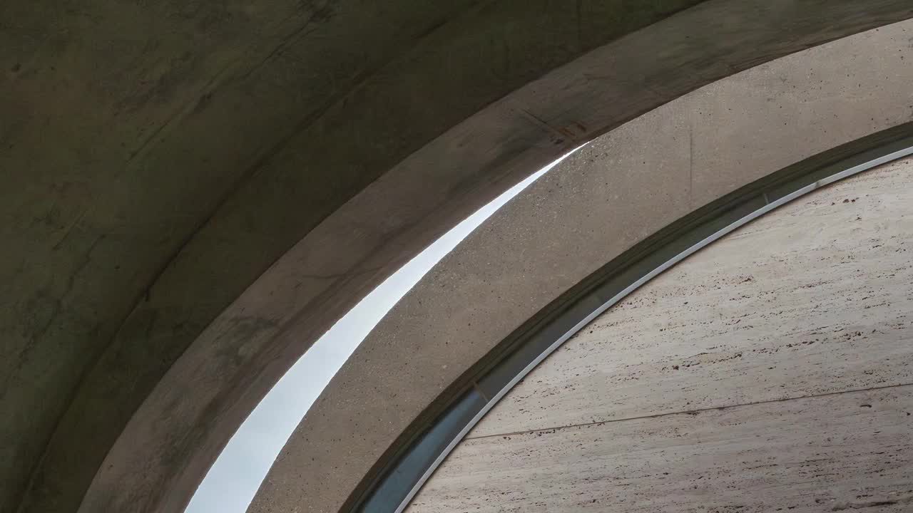
The interior of the museum is defined by a serene, "even light" cast from the vaulting above. Recognizing the overwhelming brilliance of the Texas sun, Kahn engineered a sophisticated system of indirect illumination. By "slicing through the vaults" at the center and utilizing aluminum reflectors, he allows natural light to wash across the smooth concrete arcs. The result is a "delicate, silvery sheen" that transforms the heavy mass of concrete into something that feels "light and almost sheer," evoking the ethereal quality of a "moth's wing."
Rationality and Serenity
Beyond its aesthetic brilliance, the Kimbell is an eminently "practical space." The logic of the five-vaulted interior allows for both spatial coherence and flexibility. The areas between the arches feature low, flat ceilings with runners designed for temporary walls, enabling the museum to adapt to the needs of changing exhibitions.
Ultimately, the success of the Kimbell Art Museum lies in its ability to "slow us down" and "quiet our eyes." By creating a rational, harmonious environment, Kahn crafted a space that does not compete with the art it houses but rather facilitates a deeper, more focused encounter with it. The museum remains one of the most successful examples of architecture serving the human experience, proving that a building can be both profoundly modern and timelessly classical.

Deep Learning with ListenLeap


