On Thursday, January 22nd, I'll be hosting a conversation with Nate DiMeo, of The Memory Palace at KQED in San Francisco.
I could not be more of a fan of Nate and his writing, which is the best in all of podcasting.
Please come see us and say hi.
Again, that's The Memory Palace live at KQED in San Francisco on Thursday, January 22nd.
We'll have a link to tickets in the show notes.
This is 99% Invisible.
I'm Roman Mars.
Michael Beirut is one of the best known designers in America.
You probably interact with design from Michael and his team every day, like the Verizon V checkmark or the logos for Yahoo and Slack, or redesigns for brands like MasterCard Saks, Fifth Avenue and the New York Jets.
Michael even designed the logo for Hillary Clinton's presidential campaign that H with the horizontal arrow for the crossbar.
But before all that, in 1985, Michael Beirut was 27 years old and early in his career.
He was working at the firm founded by legendary designer Massimo Vignelli.
One day, Michael was handed an assignment that seemed pretty straightforward.
The International Design Center of New York had two events coming up and they wanted Michael to create the invitations.
One was going to be an exhibition of what they thought of then, say, as avant-garde furniture.
Dramatic-shaped chairs that could have like slender little feet that would terminate in bright-colored teal balls.
You know, if you can picture that?
I don't know.
Then the other thing was a lecture by some scientists from NASA, from the space program, who were experts on designing interiors and things for people to use in outer space.
Michael started thinking about the two invitations, but then his client made a change that threw Michael for a loop.
It turns out, the design center didn't have enough money to pay for separate invitations, and so the invitations had to be combined.
Now Michael had to figure out a way to advertise two very different events on the same sheet of paper.
This decision did not sit well with a young Michael Beirut.
And I remember being like really, not just chagrined, but actually kind of angry about this.
I thought it was like real rug pull, each going to be directed to a different audience.
They were so different in character that any attempt to merge them would basically rob each of them of whatever kind of attraction they might have for their constituency.
I went on in these terms for a while.
Michael Beirut had a big challenge on his hands advertising a furniture show and a lecture about designing for outer space on the same invitation.
Ultimately, he came up with an inspired way to solve the problem.
He would make the invitation reversible.
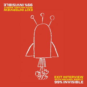
I just like drew on a piece of paper a little drawing that if you looked at it one way it looked like a funny little coffee table with those little legs with balls on the end of them, sticking out at an angle at the base.
Then at the very top was a vase of flowers with sort of some little flower arrangement bursting out of it.
But if you turned it upside down, the legs became antennas and the vase and flowers became the exhaust and the engine that looked like it was taking off.
So it looked like a coffee table with a vase of flowers.
If you looked at it one way, you turn it upside down it looked like a rocket ship taking off.
The other way,
Michael wrote the event details for the furniture show at one end of the page and the details for the NASA show upside down at the bottom of the page.
It was truly an elegant way to solve the problem.
Even now, Michael Beirut still loves talking about this invitation because it was a breakthrough for him.
It was the beginning of a long line of clever, innovative designs he's created over a four-decade career.
In 2025, Michael announced he was stepping away from his role as a partner at the design firm Pentagram.
And now he's entering what he calls his semi-retirement.
We've had Michael on the show before, back in 2017, to discuss logos.
And on the occasion of his semi-retirement, we invited him back to talk about his career, his design philosophy and some of the most interesting trends in graphic design.
Here is my talk with my friend, Michael Beirut.
You announced earlier this year that you were stepping back from Pentagram.
What did that look like for you?
If you're involved in some creative art form that could be architecture or acting or songwriting, or being a painter or a sculptor or being a graphic designer you're aware of the fact that you have some sort of talent.
And it's easy to sort of think that because it doesn't seem to be physical, necessarily you'll be able to do it forever.
There are people who do creative things, performers who do things who realize that they can't do it forever.
If you're a ballet dancer, you know that there's a limit to how long you can perform physically.
If you're a athlete, you absolutely know there's a limit to how long you can perform.
And I think one of the things that I noticed was I wasn't as good as sort of like the doing of the design as I used to be.
I could just tell it was like it was coming a little slower.
People have these different sort of reservoirs of ability I think they can draw on.
And I think I sort of sensed that mine, I could sort of see the shallows of mine and it sort of made me think, you know, maybe I should figure out a way to design my way into some new thing.
You don't know what that new thing is.
And I realized I wouldn't be able to fully envision the new thing unless I had completely or at least started moving away from the old thing.
One of the ideas I had for this interview was sort of taking your, you know, emeritus status and like and do a little bit of a performance review of your career.
And I wanted to see if you would consider, you know, like if you could sort of go with me.
And so if you could, if you could talk to me about, like you know, what do you think was your biggest achievement?
What was your best work you've done in your career?
Oh, well, there's like, I mean, it's funny.
There are like favorite projects one has.
There were a couple of watershed moments that I had as I was going along.
Earlier today, on my way to record this session with you here in Manhattan, I rode a city bike up 8th Avenue and right by the front of the New York Times building and a.
We did all the signage for the New York Times building when they moved into the Renzo Piano headquarters that they occupy now, including the way it says the New York Times in front of the building.
And we were faced with this challenge of putting a sign on the outside of the building facing 8th Avenue.
It's a block-wide building, so this is a block-long sign, basically.
We knew that it had to say the New York Times, just as it does on their website or as it does on Twitter on the printed newspaper.
However, the architect Renzo Piano had designed a building that was all glass and steel.
Renzo Piano and his team designed these kind of like veils, almost made out of horizontal, thin ceramic rods that are mounted on each face of the building.
So it's sort of like open Venetian blinds if you've ever had those in your room, you know.
You perceive, as you're looking through the windows of the Times.
You perceive these horizontal elements, but you can see right through and you can see whatever you want to look at outside right.
And so it was upon those horizontal elements that we were expected to stick our big sign.
And the sign is like literally one story tall.
The letters are really big because they run a block long.
And we proposed that, instead of one big sign that what would happen if we took the New York Times logo and broke it into 300-plus much smaller elements that in the aggregate would – create the New York Times logo.
But each one of them was just a horizontal element that would be stuck at a certain point onto those horizontal rods.
And moreover, in order to enhance an effect we thought we hope would work, we made each of them kind of have the shape of a duck bill.
So there's a point that kind of protruded out horizontally that you wouldn't be able to see from inside because it was pointing out instead of in.
But If they were all installed properly, all lined up exactly right, and then you were down on the sidewalk in front of the Port Authority building, right across the street, and you looked up, you would see what appeared to be an absolutely legible and opaque New York Times logo sign there.
So it's sort of this neat little thing where, if you're looking at them straight on, if you're eating lunch at your desk up on one of the floors
And I was always told it was like the obituary department that faced the back of that sign, which I thought was – there was something apropos about that.
I don't know.
But if you were at the desk there, you could look straight out and see the glorious facade of the Port Authority building.
Sarcasm.
But you had a nice view of that and New Jersey beyond.
Yeah.
You know, we had no idea it would work.
And then one day I was on a bus going up 8th Avenue and I thought aren't they supposed to be installing that sign like this week?
And I looked and they were actually installing it.
And I was like one of those cases where I started like yelling and clapping on the bus with other passengers around me.
And I was saying, it works, it works.
And people just literally, well, it's New York.
So people just politely ignored me.
They exhibited no interest or concern about whatever breakdown I was having.
But I was having a breakdown about a sign on 8th Avenue, as one does.
So, by contrast, in sort of our performance review, can you think of a design that you would have done differently?
Oh my God.
There's so many things where I realized they were missed opportunities, or that idea you have of the staircase as you're going home, like the thing you should have said, the thing you should have done.
That's happened over and over to me again.
And some things I just can't look at because it just represents, like, such a missed opportunity.
Now I would add that many of these things the client was really really well satisfied with the thing.
So I'm almost reluctant to name names in sort of ways.
Well, can we get you to name one?
I'm trying to think if there's something so remote that it would be okay.
Or, like, they were so satisfied and, you know, it's just your thing.
Oh, well, I mean, the early, early...
It was funny.
It was like one of the first projects I ever did.
I was still in school when I did it.
And it took me probably 15 years to learn the right lesson from it.
I was going to college at the University of Cincinnati.
I hung out at a place downtown called the Contemporary Arts Center, which was sort of Mecca for modern art in Cincinnati.
Mm-hmm.
And I got this amazing, startling plum job which was to design a catalog for a major exhibit they had on the work of the theater artist Robert Wilson, who just died, I think within the past year actually.
You know it was a combination of his sketches and furniture and set pieces he had designed for different productions he had done, the most recent of which was Einstein on the Beach, which he had done in collaboration with Philip Glass.
So they needed a catalog for this and they said they would pay me 1000 to design and produce this catalog.
And I had never, like, thought—I'd never even—
Like uttered the words $1,000 before my knowledge.
So I was like stunned by this.
And I thought, you know, this is, you know, this is the moment.
And then I remember every aspect of it kind of baffled me.
I had never heard of Robert Wilson before.
I'd never heard of Philip Glass nor Einstein on the Beach.
The music sounded like no other music I'd ever heard and like not – it was not like – useful to me to be hearing this music.
And all I saw were, you know, about, you know, 5,000 words of manuscript and...
40 to 50 images with captions.
And I knew I had to bring this thing into a form that would be 8 1⁄2 inches wide, 11 inches tall and probably no more than 64 pages long.
And the technical requirements of jigsawing those hunks of thing together completely occupied me in terms of all I did.
And it was hard to do, and I acquitted myself well.
Three-column grid, one type size throughout.
The grid was deployed nicely.
The typography is all very nice.
About 15 years later at the Brooklyn Academy of Music, I saw a production of Einstein on the Beach.
And you know it's like the most physically powerful enthralling hypnotic immersive, over-the-top intellectual and emotional and aesthetic experience you can have.
It's like, you know, I mean—
It's so powerful.
And I remember thinking I didn't get one millimeter of this into that stupid catalog I did for a thousand bucks back in 1980.
And even now, every time, like, I don't know how many, you can, these are hard.
This is an expensive, rare thing to buy.
If you try to get one of these things on eBay or something.
It's expensive to get one of these catalogs from this obscure little thing way back in the day.
And every time I see it, I just like want to kill myself.
It's just like...
Are they expensive because you're buying all the copies to burn?
No, maybe I should, yeah.
I mean, it's sort of a – it's just so – it was so inept and like – and almost every big error I've made ever since then was some aspect of that.
There was something that I didn't realize soon enough, something I didn't know.
And had I only known that, I would have thought differently about it.
And a lot of times –
For the first half of my career.
The clients were trying to tell me and I was too busy arguing with them so they would do it my way.
And then I finally, somewhere along the way you know, learned somewhere in the 90s, learned to shut up and listen to.
When in doubt, just ask another question and let them talk.
I know that embarrassment like that of work and you realize like oh, you come across a new fact, a new thing and just like, why in the world did I express some opinion about this 15 years ago, when I had no idea?
But you had to.
You had to.
It was your job to express that opinion, and you worked with what you had.
And you know I mean.
That's the one thing about getting older.
If you respect that, you know the opportunities that curiosity afford you.
As you age, you get smarter and smarter and quote-unquote, wiser and wiser say, and that they can't take that away from you.
You know you might not be your chops in terms of actually doing the craft may start to recede a little bit.
But you sort of have this reservoir of experiences that if you don't get too enamored with a Tales from the good old days and bore people with those
But if you're actively kind of curious, there's no telling what kind of stuff you can discover.
Talking about highlights, I want to talk about one of your more ambitious design projects the billboard charts, which you totally redesigned.
By the way, I had no idea about the origins of the billboard charts until I read your book.
Yeah, it's been around for a long time and it was like a trade magazine for carnivals, basically way back when.
So it's sort of associated with the American world of entertainment for years but only really acquired the association with music, you know mid-century and beyond that.
Yeah, it was like a trade magazine for billboards.
Yeah, for billboards.
For people advertising circuses and things, yeah.
It's so funny.
It makes sense when you think about it.
It's right there in front of you.
But the Billboard Top 100 charts, they rank the most popular songs.
And the original chart was just a list.
And that's it.
And you redesigned it.
You added color and different font sizes and things that really pop out in this new version.
It feels more vibrant.
It feels more, like, emotional.
Could you talk about that redesign?
People who cared about it, cared about it.
And I was really happy about that.
I knew that when your song hits number one, you're going to frame this and hang it on your wall.
And so I have to do something that is up to that moment.
So basically, the Billboard top 100, or the charts in Billboard are all doing the same thing.
And what they're doing is, at minimum, just kind of lining up from like 1 to 40 or 1 to 100 or 1 to 200 or however many are on the particular chart like the top selling quote unquote songs or albums in America or in the world, or in genres or whatever it is right.
And so they have to be listed.
There's also, I believe, it's the title of the song.
It could be the label that it's on, the writer, the performer, obviously, the writers of the song.
There's lots of information you could get onto it.
But I think It was sort of like a way of heat mapping the charts as well that they've done in different ways over the years, where they were trying to say what songs have made the biggest leap up.
And when we redesigned it we sort of started building in ways to kind of visualize that by what color we were making the individual entries.
So you could kind of see at a glance, you could kind of read different levels of information, not just the kind of rundown from one to whatever, but also kind of get a little behind the music vibes, even just from looking at this chart.
And I think that's what great information design is.
I'm not a physicist, but people can look at the periodic table of the elements and kind of it speaks to them at a certain level, because they're Not just because they know what each of those confounding abbreviations stand for.
Why wouldn't PB stand for lead, for instance?
But they also can tell by the position on the square what are adjacent to them, what are the atomic numbers associated.
All those things are telling these really complicated, rich stories.
And I think when you're doing something like those charts, you're trying to like just add as much, trying to figure out how much information can you cram into them.
You know, data visualization, it's information design.
It's all you're doing with designing a chart like that.
But it's also doing something where each one of those songs power of cheap music, as Oscar Wilde once said, you know, it sort of really does, you know, connect up with people and it's memorable and it means something.
And you're the custodian of that if you're doing that work.
After the break, Michael Beirut is a graphic designer, but he's also a prolific design critic.
I'm going to ask Michael about a couple of recent design trends, including the viral designs from the New York City mayoral campaign of Zoran Mamdani.
More with Michael Beirut after this.
We are back with designer Michael Beirut.
Every once in a while, I see a thing and I think, oh, I want to ask Michael about this.
And I should just email you about it.
But when I see a design trend or I see designs that have gotten a lot of attention, I just want to get your vibe on it.
And I want to start in your neck of the woods with New York politics.
The Zoran Mamdani campaign received a lot of praise for its design.
It used bold colors and different fonts than what you're used to in a political campaign.
It's become kind of memefied, which I don't know if that's like an indication of success or something or just an indication of something you know.
I just wanted to get your take on it.
What did you think about it, and what do you think it's doing?
What Zorin Mamdami did with his campaign and his designers who worked with him on it is that almost every single element graphic element, sort of had a precedent that people were familiar with.
It had like a deep yellow-orange-blue combination that people would recognize from –
Everything from taxi cabs to their Metro cards that got them out of the subway.
Orange and blue is also kind of the New York colors of the Knicks and the Mets et cetera, et cetera.
So it was a little bit of a play on that.
The lettering all kind of evoked the hand-painted lettering you see in grocery stores and bodegas.
So very much street corner, street culture everywhere.
Not in a way that was pandering, I didn't think, but in a way that actually seemed truly rooted in what the candidates' background and interests were, you know.
And then I think anyone who knows politics listening to this, I wouldn't want them to think that you know, a graphic designer on a design podcast is thinking, and that's why he won.
Those colors and those typefaces and those points of reference, you know.
No, but I mean obviously he combined that with an absolute unique ability to connect with people in.
What I would say very specifically is the vertical video TikTok-ready mode of address that is very, very familiar to young— I was going to say young people, but grandmothers and grandfathers watch it as well.
And I think you sort of realize how few people are at ease in that.
You know, you sort of have to feel—
You need a kind of dancer's grace with your body to pull that off, to do a walk and talk like that and compare him to his immediate competitors and compare him to most people you see trying to do that.
And he just had this miraculous – I mean, I can't – it's in a way, it's sort of like John Kennedy and the first debates with Nixon that were televised, where all of a sudden people realized –
These are two perfectly regular political candidates, but one of them seems to really look good on TV.
And what is that magical quality?
And, you know, all the makeup and prep in the world never got Nixon there.
And JFK had it.
And then I think... the graphic design language met him where he was.
You know, and I think this all the time.
I've had lots of great ideas and lots of great design work, but you really need a great client in order to do good work.
You can't just kind of like go out there and say, here's great design work.
Who's buying or who wants to admire it?
You sort of like need to connect up with a client.
You know, in this case, I think it was a combination of really well-chosen, really carefully calibrated and administered graphic standards that actually drew their inspiration directly from things that people were really familiar with.
And I think it's interesting because that's sort of it's a truism, and you may have heard me say this before.
I may have said this the last time you interviewed me, but...
When I read that theory that Raymond Lowy has is that all design is sort of negotiating between the familiar and the novel.
And people have this dual appetites for those two things.
You know, they want to experience new things.
But if all they experience all day long are new things, it becomes exhausting and disorienting and you put your head under the pillow.
But if all you experience is familiar things, there's an element of comfort there, but it gets boring, right?
And so I think every time...
A designer, particularly a graphic designer, whose job it is to communicate with people, is picking the ingredients by which we're going to do the work.
You're sort of trying to pick things that will evoke familiar elements to people and then somehow do it in a way that still seems surprising and arresting and differentiating.
We have midterms next year and I feel like we're going to see millions of campaigns that use Zoran's type of branding, with new fonts and colors that look different from traditional campaigns but maybe look a lot like each other.
Everything in design is like this.
When something is successful, then you see it everywhere.
Which brings me to one of the other things I want to talk to you about, which is book covers.
You've designed a lot of book covers.
And right now, it feels like...
Every other book cover is like a painting with like a big bold type on the front of it.
I think book covers are really interesting because they're combining two things that seem almost opposite.
One is, you know, they're responding to...
Content that you know.
Sometimes you're creating design and there's hardly any content to work with right.
You know you're doing startup for some AI company and they read the brief and it sort of could be identical to 2200 others.
They've got some preposterous name and you just have to figure out a way to make it, you know.
Live another day somehow, right?
With the book, though, someone's actually poured their heart and soul.
Single human beings pour their heart and soul at least so far, for the most part pour their heart and soul into a book that they care about, and the book is seeking readers right.
But then to get those readers it has to compete at the level of consumer product packaging, just like a box of cereal or a bag of potato chips or a – bottle of energy drink.
And it then kind of reverts to all the things you have to do when you're doing consumer packaging.
So I think a lot of things that happen with trends and book covers are.
It's just trying to signal to people if you like this sort of thing, this is the sort of thing you'll like.
And, just like Darwin said in his writing, there are mutations that will happen that, if they're successful, end up kind of creating a new evolutionary path to something new, through what's that called?
Selective, what?
Natural selection.
Natural selection, yeah.
And so I think you know everyone sort of thinks oh, I want.
Well, You know, people will sort of see that and think you know, I want to catch that sort of vibe.
I mean, I remember when The Tipping Point first came out.
Oh, yeah.
Yeah.
I had so many publishers that would come to me and they sort of – and the book was always the same kind of book.
It was a nonfiction book on a subject that sounded like college course level sociology or something.
But whoever had written it – had come up with this kind of clever way of making it seem accessible and lively and worthy of podcast appearances or something.
And they would say, okay, you know, do whatever you want.
But you know, I think a lot of white space if there's an image, maybe it's like a little image, you know, and then— the type should feel kind of literary.
And, like I'd say, you're describing the cover of The Tipping Point by Malcolm Gladwell which I think had you know, it said The Tipping Point in little all-caps serotypography.
Said by Malcolm Gladwell in all-caps serotypography.
In between, I forget if there was, like, a matchstick or some— Like a match?
Some little same-size thing drowning in white space.
And like if—you know and you can tell, like what's funny is that they weren't—.
It was frustrating and aggravating, and I assume, for all book cover designers and even for many authors.
But what they were trying to do was kind of just— get in costume, for you know, if you like this, you'll like that.
They're just trying to like kind of visually support the algorithmic recommendation of people who bought the tipping point.
Also enjoy this, you know.
And how do we signal that with design?
So I think a lot of trends Period happened because of that.
You know, I think every design is simultaneously trying to look like something you've never seen before, but it has to operate within something sufficiently familiar that you can process it within your own field of knowledge, in a way.
You've said that one of your favorite book covers is the old paperback, the maroon paperback, of Catcher in the Rye.
It is just text with a sort of maroon background.
Why do you like that one so much?
Well, when I say that book cover fans out there, I'm referring specifically to – I forget who had the – I think it was.
Bantam Books published the paperback.
Catcher in the Rye used to have this maroon cover.
Yeah, with no image on it at all and just the words Catcher in the Rye in all caps times, Roman in yellow.
And underneath it, smaller, in all caps, times Roman, yellow, was the author's name, J.D.
Salinger.
Like I remember, before I had read that book, perceiving that it was forbidden and slightly dangerous in a way.
Hmm.
And I was used to reading.
You know they didn't call it young adult fiction there, but I was like I had like read a lot of Hardy Boys and stuff like that.
I remember seeing that book and thinking every other book had a picture on it, a picture of kids like me doing kids stuff.
And it was supposed to be fun.
And then here's this book that only has type on it.
And I only knew one other book that looked like that.
And that was the Bible book.
The Bible said, Holy Bible, King James edition.
And that's all I had on the cover.
So I thought, well, this book must have some weight to it.
I remember from the first sentence just being absolutely mesmerized by it.
It was a tone of voice I didn't know it was legal to print in books.
And it just spoke to me like someone was talking to me face to face.
And I associated the connection, the emotional connection I had with the book with to the mysterious presentation of the cover.
And there's just something, you know, all of us have things like that.
It could be an album cover.
It could be a band logo.
It could be a fashion brand for some people.
And there's just something about you know the way that they've chosen to present it and the way it connected with you at a certain moment in your life emotionally, that you sort of invested with all this, meaning that in a way you can't point to anything about it.
That sort of is the carrier of that meaning.
It's two colors.
It's the most banal typeface in the world, times Roman, you know.
And it's the most default typeface in the world.
So there's something about it that was just so evocative to me.
That sort of made me realize that Emotionally, design can work in a lot of ways, but what it always needs, I think, is a reference.
It has to be representing something that actually carries that weight.
It can't invent that weight out of nothing.
We are running out of time, unfortunately.
You've talked about your retirement in other places and you said that you're going to miss the design challenge, but mostly you're going to miss working with your team, and I'm wondering if you could talk a bit more about that.
Design is the most wonderful thing in the world.
The things that we would say in meetings, and a lot of times I would come home and Dorothy would say you know how was work.
And increasingly, my report would be, someone who worked for me just designed the greatest thing.
And like I can't tell you how many times, I would sort of like bring the whole office to a halt, screaming sometimes like swearing, like God damn it, you motherfucker.
And I just would be like clapping my hands.
It just was just so fun to see someone, you know, hit on something like that.
And it didn't happen every day but boy, you know, those days when it did happen, it would make my day.
And what's so funny is it didn't matter to me at all whether it was happening to me or happening to someone else.
Even having this—you know, I was in the office a few weeks ago and two of my partners were working on something, a project that I was aware of.
And they said, do you want to see how that came out?
And they showed me the thing they were going to propose to the client.
And it was so perfect.
I kind of just was like God damn, I can't believe you— did that?
It's so great, you know.
It just made me so happy.
So I mean I love design, but that doesn't mean I need to do all of the design in the world.
I mean I love it as a spectator as much as a participant.
Yeah, I feel the same way as my sort of show has grown and on all the people like are, you know, really just more talented than me, you know, and it's sort of just that just feels like pride.
I feel so good about it.
Like I always do.
I always say that people's career, like in the in the beginning you don't know how to do the thing you do, but you try.
And then in the middle of your career, like, You're like, there's one way to do it and it's my way.
And then the end of your career, you're like, there's a million ways to do it.
And probably someone could, anyone could do it.
And probably as long as you execute it well, like I can be convinced, you know, like you just got to get sanguine at this stage of just like, of just enjoying people solving a problem in a way that you wouldn't solve.
And I love that feeling.
I cannot tell you how much I love that feeling.
I'm a musical theater aficionado and one of my heroes is the late Stephen Sondheim, who you know famous first as a lyricist for West Side Story, but then he began writing full musicals or became a music and lyrics guy.
You know, a million shows that were just amazing.
And he had a run in the middle that was just like one audacious thing after another.
And then you know he lived into his 90s, but I would say along the way, probably even as early as his 60s he started.
You know, somehow he didn't quite have it anymore, if you ask me.
And this is someone who admires him beyond all words.
And you know, in his last decades he really just had a few shows, some of which never really got completely worked out.
None of them were world-shaping hits the way that or influences in the culture.
Even that his earlier work was.
On the other hand...
Every other day I'll encounter online a letter that he wrote to a young person in the theater.
And it isn't like the polite write back to fans.
It was like...
You can tell that they didn't know he was in the audience to see this workshop show.
And he had to write a letter afterwards just complimenting them.
You don't know me, but we've never had a chance to meet, but I just have to tell you how enthralling I was when I saw that production of Blah Blah, Blah.
And I just—I mean, I just read one.
Someone just published one he wrote the other day.
And when he died, you know, people surfaced and they said I was no one and I got this letter from Stephen Sondheim.
And it, like—
It gave me the courage to go on.
So I think if you're looking for a worthy thing to do in your golden years, Roman or Michael, you could do a lot worse than trying to figure out a way to make the world a better place not by – kind of going back to the grindstone with renewed flagging vigor, but to just identify the people that are really going to help move the world forward and give them everything you know, give them all the support you can give them.
I think it's really a beautiful thing to do.
That is a perfect place to end this.
Michael Beirut, thank you so much for talking with me.
Roman, thank you.
I wish we could do this.
Well, we should do this like every 10 years or so, maybe, see how that goes.
99% Invisible was produced this week by Chris Berube, mixed by Martin Gonzalez, music by Swan Riel.
Special thanks this week to CDM Studios in New York for recording Michael Beirut's side of the conversation.
Kathy Tu is our executive producer.
Kurt Kolstad is the digital director.
Delaney Hall is our senior editor.
The rest of the team includes Jason DeLeon, Emmett Fitzgerald, Christopher Johnson, Vivian Leigh, Lajma Dawn, Kelly Prime, Joe Rosenberg, Jacob Medina-Gleason, Talon and Rain Stradley, and me, Roman Mars.
The 99% of visible logo was created by Stephan Lawrence.
We are a part of the SiriusXM podcast family, now headquartered six blocks north in the Pandora building in beautiful Uptown Oakland, California.
You can find us on all the usual social media sites, as well as our own Discord server.
There's a link to that, as well as every past episode of 99PI.
And I recommend you listen to the other Michael Bay Root one.
It's really, really great.
You can hear it at 99pi.org.