It's easier than ever to design with AI tools, but that doesn't mean you should always accept all changes.
So today I'll be joined by Rafael Schad to look at the good, the bad and the ugly of AI-assisted design and sort through how to use these superpowers to stand out.
Welcome to another design review.
All right.
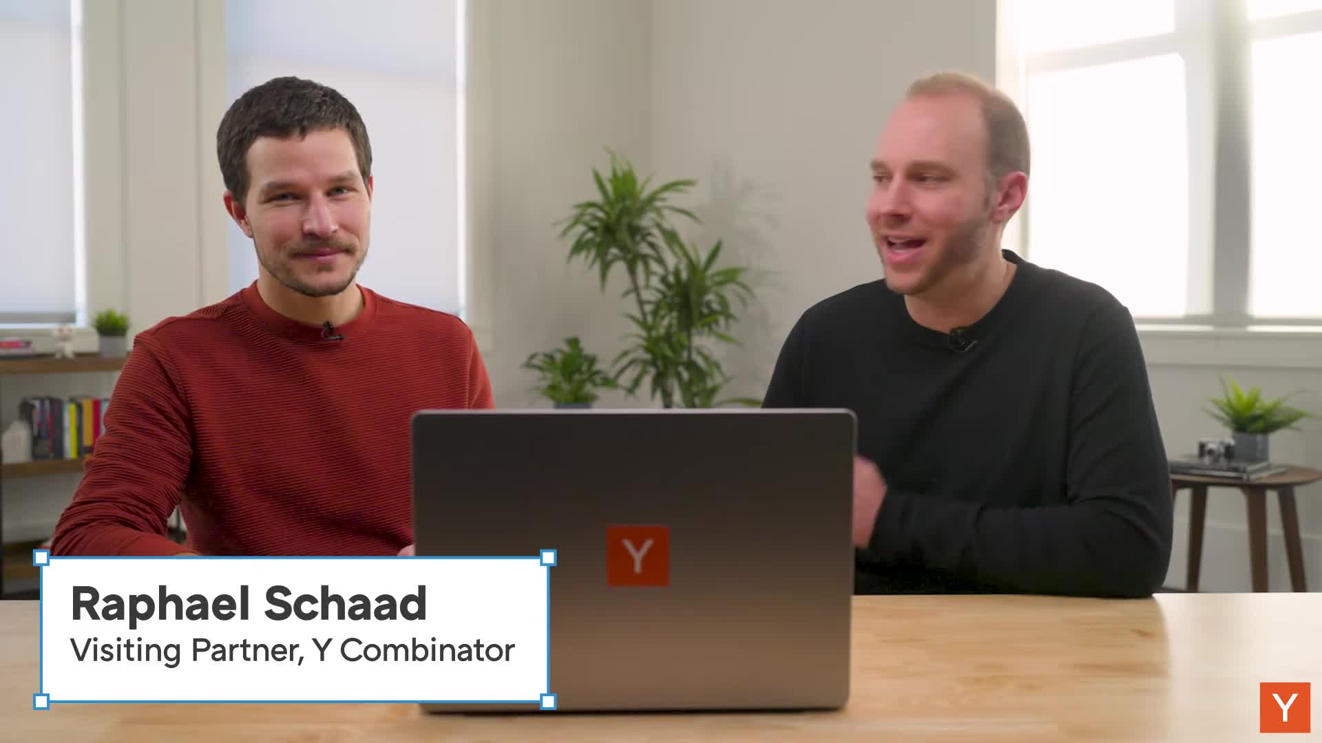
Today, I am thrilled to be joined by Raphael Shad, one of the newest visiting partners here at YC.
And Raphael was the co-founder of Cron, a modern calendar tool which you sold to Notion a while back, and are also one of the top designers that I know and have worked with.
So Raphael, it's an honor to have you here and it's an honor to work together now at YC.
Yeah, super fun to be now back in NYC and helping founders next generation founders build iconic companies.
Well, you're the perfect person to have on here, because the topic that we're going to be talking about today is AI design trends.
On the negative end, there's the AI design slop.
And on the positive end, there's a lot of AI design trends that now are easier to build for anybody, even if they're not a designer.
So what are some of the common things that you've seen recently?
A lot of the top AI design trends that are standing out that you'd want to call out for the audience before we jump into some sites.
Yeah, sure.
This all kind of started when I had like a late night thought and tweeted that I see a lot of dumb hover effects on landing pages of startups these days, presumably white coated, and so i was kind of curious to peel the the the layer back there.
It's like, how did these, like what i thought were dumb effects um, how did they make it into llms and why are they everywhere now?
A couple other trends that we then identified was kind of like purple gradients um, all of a sudden, all startup websites um had purple gradients everywhere, or these sections that can like fade as you go in, as you scroll, and they fade in and fade out.
Yeah, and it's not so much that those inherently are bad.
It's not purple gradients are bad.
Nobody should ever use them.
It's that now they're just so ubiquitous everywhere that they kind of lose all meaning and specialness and originality.
Totally.
And one of the key things was when there was a good website establishing a trend.
It took a while in the old world for others to copy these trends.
But now with LLMs if there's a good website with a purple gradient, it makes it into the LLM because the LLM gets trained on the good examples that get linked to a lot.
And then all of a sudden, like the next week, all the startup websites look the same.
Yes.
And so this is both good and bad if this power is used in the right ways.
So we've got a bunch of YC companies that have submitted their websites that were all built with AI coding tools.
So this should give us good grounds to figure out ways that they have been used really, really well and things that we would do differently if we were designing it ourselves.
So let's dive into some examples.
Let's have a look.
All right.
Okay.
First up, we've got Nunu.ai.
Solve your game testing with AI agents.
Save countless hours of manual game QA by using AI agents performing end-to-end tests at scale.
Purple gradients.
It's the first thing that jumps out.
It's a very purple site, which we were just talking about.
That's one of the most common things that you see.
It's interesting.
Like pre-llm day, i think i would have looked at this and gone like wow, this looks really nice.
And now i look at it and i'm like they used ai to design this.
Maybe they didn't, but like that's what it screams to me, okay.
So one thing is interesting as we, as you start scrolling here, we've got this line that's following us up and down um, And it's interesting because I actually find this line to be a little distracting.
I'm paying more attention to the line than I am the things that I think that it wants me to pay attention to.
It's almost like something that it's kind of like probably hard to implement for a human.
And you would have never thought to actually code this up. before AI.
And just because we now can, just because LLMs are kind of good at these type of like SVG, you know, buildups or transforms, doesn't mean that it's actually a good design and helps you convert potential you know visitors into customers basically.
Yeah.
Yeah, I don't know anybody that's like, we need a line that goes through here.
Let's start coding that from scratch.
Like you would only implement something like this because it was so easy to do.
But I don't think it actually adds value.
If anything, I think it distracts from the rest of the page.
I can't recall anything from these sections based on this.
Okay, so now we're down to everything in one place.
I find this hard to read.
It's very light.
Maybe I'm just old.
Yeah, contrast could be improved there a little bit.
Yeah, these cards are interesting, right where it's cool.
Um, this is actually pretty good.
Uh, this is uh, probably something that would have been maybe too expensive to do or only like the very best, or like website designers would have kind of got gotten to the lengths of of doing something like that these hover animations for the cards.
But ai is so simple to do And this is actually like a pretty tasteful way of using, leveraging the powers of LLMs to build more compelling websites.
Yeah, what's cool about it is it feels like it helps establish the brand and it's unique and it's creative and it's fun.
And it's actually trying to.
You know, multi players like two controllers with lightning connecting them.
And it actually helps reinforce the points that I think that they're trying to make here.
And this is a great example of you know where the line that was following you down the page didn't add much value.
This would have been really hard to do.
And now you kind of get it for free.
You don't have to go from scratch building a lot of this stuff.
One of the things I want to try out is up here.
So we here have the main navigation.
One of the things that jumps out here is that as you hover, you generally want to make things pop.
But here, it actually kind of disappears.
So instead of inviting to click to talk to them, it kind of goes into the background.
Same here.
It kind of fades out as you activate one of these menu points.
This is something that I think a designer would almost never choose to do.
And the default of browsers also doesn't work that way.
And now LLens just somehow decided that that's a good hover effect, but it makes no sense.
Think about it that way.
The browser already has a built-in hover effect for free, even without CSS.
It turns the cursor into a hand.
So that already indicates I can click here.
So just leaving it white in this case, or just kind of like the bright purple, and then having the hand already tells me like I can click on this thing.
So if you want to add a CSS effect, then, you know, make it maybe like a little pop.
Maybe make it like one shade lighter or more active, or add like a little, you know, a little glow around it.
But don't make it go away.
Yeah.
Do you have any rules of thumb when you know you're designing something and you're trying to come up with hover effects?
Like what are your goals when you are trying to come up with the right hover effect?
Yeah, make it sort of like clickable.
Steve Jobs famously said, you know he wanted to make things lickable with the Aqua interface back in the day
I think, you know, make things, you know, clickable.
Kind of like inviting to click.
Stick to sort of like pretty standard again, kind of.
I think the hand indicates that something is clickable.
And so I wouldn't go much beyond that.
Another thing that I see hover being used is a lot to kind of like reveal additional information.
So not just kind of like a hover effect to make the UI more feel alive.
Like hover is great to kind of make UIs feel more alive, right?
But I see it increasingly used to kind of like disclose additional and critical information or functionality.
And I don't think that's the best use for Hover.
This whole trend that maybe like kind of like Mac OS kind of started to over the years to get more and more into kind of like very clean interfaces, get the functionality and the tools and the buttons all out of the way.
So there's all this space for content.
I don't want to have my computer to be just like all content.
I actually want it to be, you know, a bicycle for the mind, a tool.
And so revealing additional functionality only on Hover and you have to go hunt for what the tool can actually do.
I think it's kind of like an anti-pattern.
Yeah.
Not to mention that, you know, there isn't a concept of Hover on mobile as well.
Yep.
And long press, which is kind of the equivalent of hover, never really caught on on mobile.
Probably because it's so hard to discover.
You don't want to sit there long, pressing all the time to try to figure out if there is any addition.
Now think of a desktop interface, a tool where you have to hover around everywhere to discover where the stuff actually lives.
The disclosure arrows or hiding something or getting to a dot dot dot kind of menu to get to extra functionality.
If that's all hidden behind hover, then you're just not as efficiently communicating the functionality of your software.
Yeah.
Overall, I think this is a very nicely designed site.
I think it's easier than ever using AI design tools and LLMs to get a professional looking site.
There's almost no excuse for not having it now.
And especially as we're reviewing YC applications.
If you look at a demo and that demo does not have a base level of quality design, it seems like the person just didn't even try because it's so easy to do it now.
So Nunu, really cool site and some really interesting applications of using AI here.
So well done.
All right, next up we got Rosebud AI, create games with AI.
And once again, like you start to see the trend here we've got the purple gradient again.
We've got a very similar kind of pinkish purple accent color up here.
And that's why, like in isolation with one of these, like it looks cool, it looks modern and everything.
But you know, one after the other, they all start to kind of look the same.
And it takes away a lot of the core brand and originality and things like that that I think most founders want for their site.
So let's dig in here.
This is the first time we're looking at these live.
So Rosebud AI, Craig Games of AI, and there's a prompt to game kind of interaction, I would assume.
Um, that's cool, there's something you can instantly play.
Yeah, let's try it.
Whoa, it's like a 3d game in the browser.
That's cool.
There's a person walking around.
Can i use the arrows?
There we go.
Oh wasd, we have a old school game.
All right, you can jump.
All right, let's uh escape out of this.
Um, but cool definitely, kind of like engaging.
Um, I wonder whether this is actually their like product code running on the website here or this is like a vibe coded sandbox environment.
Yeah, I would assume that this is the type of thing you can create with their product.
But that's an interesting point is that they don't really tell us.
It doesn't say, like play a game made with our product right now.
Um, it's interesting.
Is this following us?
Yes yeah, these are just anchors jumping vertically around yeah, so what's interesting is i didn't realize this at the time, but when we went to that one, we were just playing.
That was under modify games, And so what I wonder is if this is a game that has already been created that we can modify in real time, and that's what they're trying to show off, rather than the creation part.
Yeah.
So maybe kind of like a thing to take away here is that using this kind of like non-standard navigation is tripping us off a little bit on how to use this website.
Another thing that kind of jumped out here at the top is like I don't think anyone would think of combining a red logo with purple as an accent color, necessarily.
It's not necessarily complimentary and I guess Whenever I see the use of emojis even though they're not the system emojis I feel like it's a little lazy.
And so I feel like LLMs kind of take the easy path because they don't have any IP really themselves.
They're just like big models kind of cobbling things together.
They use like these standard icons everywhere and it's just immediately kind of like a tell.
Yeah, I think we could just use more context up here too.
And, you know, the name of the company is here.
It looks like it's almost part of the headline, rather than I would expect it to be up here by the logo.
Yeah, and then the value prop kind of being more clear.
Create games with AI, something, something.
So it's kind of like what's important for the H1 is typically kind of, what is it?
Who is it for and to what end?
Why should that person that it's for care?
And if those three things plus a call to action are not kind of above default, then it's a harder time to convert visitors.
Yeah.
Okay, we've got some, I guess, examples of games.
Yep, so games created with Rosebud AI.
Okay, so there's another effect here.
You can see the light following my cursor. around the edges.
And yeah, this is the kind of thing where, you know, you're like, hey, it costs nothing to do this.
Then maybe you're like, yeah, sure, let's throw it in.
It's fun and it's playful.
But if you had to spend a week coding this and you know getting it to work right, you'd be like that's not worth it.
Okay, so we've got a lot of game examples and it looks like maybe this is just the rest of the site here.
Okay, and then we hit a footer.
There's a create from.
Is this like remixing?
Yeah, okay.
So some of the projects you can remix and then it kind of puts up the conversion wall.
Okay.
That would go beyond sort of like landing page.
Mm-hmm.
Very cool.
Awesome.
Well done, Rosebud.
Okay, so next up, we've got Get Crux.
And one of the first things that I noticed here was kind of the fade in.
It was this automatic fade in.
Oh, and another thing that I noticed is my scroll is hijacked here.
Yeah, it's maybe a little hard to see on screen, but there's certainly some scroll jacking logic going on.
And there's also like a state where you see both the detached and the fixed header menu, like both at the same time, like right around here um, so typically kind of like they should just smoothly i like the sticky header um, but it's just like smoothly transition one to the other and here you see so, like that, you know they're clearly two distinct menus that just happen to gonna be the same.
I'm sorry, i'm so distracted by the button that's chasing me around the screen here um Yeah, I almost feel like it's hard to get the button to click on it because it's constantly moving.
Does it make you want to talk to the founders more or less?
It makes me distracted, I would say.
I'm not paying attention to what they do.
I'm just...
I'm like, why is this button following me around?
It definitely got my attention, I would say.
One of the other things that I noticed first too, is almost these meteors that are shooting down from the angles.
You can kind of see them over there.
That's another kind of thing where it doesn't feel like it actually adds a lot of value to the product.
And again, if you had to build that from scratch, like it would never be worth your time.
But it's so easy to do it that people are like, yeah, let's throw that in.
It looks cool.
But I actually find it a little distracting.
I don't think it adds value to the product here.
Then the hero screenshot here is, I guess, a poster image for a video.
And it goes into what looks like a completely different video.
Yeah, that's confusing.
And the poster image is just very blurry here.
I don't know whether this is an artifact of using AI or not.
But just as a general design principle, I think all your assets should be high res, high quality.
And this just looks like something very blurry.
Yeah.
And again, back on the button, too, because even when we're down here, it's still chasing us around.
This is another example of the type of thing that you would only do because it's easy.
But just because something is easy doesn't mean it's worth doing.
There's a lot of things that are now at your fingertips with AI, that anything imaginable is possible.
Just because something is possible doesn't mean you should say yes to it.
Here we're kind of like hitting a little bit on just a lack of visual consistency.
Like this looks like an entirely different visual language than anything we've sort of seen above.
Where do you think that comes from?
I wonder, maybe different sections of the website being made by different parts of the tool.
Maybe it's also just kind of like a function of this year, looking very different than the website content.
Yeah, sometimes just like a clear image with a little bit of text, maybe a headline and then some subtext goes a long way.
Yeah.
And I got to say, we're like halfway down the page right now.
And if you asked me what they did, I would not be able to tell you.
Let's go back up to the top and remind ourselves, AI creative strategists to make ads that work.
Okay, so it's something to make ads, it sounds like.
It's interesting.
They do kind of have like a visual style to it with a lot of these.
It's almost like a vertical motion blur or something on a color gradient that we see in some of these images like these right here.
And we saw the same thing in these here and these here.
And these here, but it's it's constrained to some of these elements and it feels like, you know, it's maybe a little overused here because it's hard to read these and this feels like more like a rainbow, rather than calling the attention to it, but up here does not have that style at all, which was maybe you know the point that you're making earlier.
And I could see something where the background here is more reflective of this type of style.
And then that might carry it through all the way through the rest of the page.
Yeah.
Let me quickly reload the page and try something.
So we see all these sections kind of like fading in.
And here again, it's just like fading in.
And one of the things that I noticed I just don't see the advantage of having these things not just right there as I scroll.
Because scrolling already like is the motion.
Why does it have to like also then kind of like fade in?
And one of the things that you get is these weird, for example, here, right?
We say, we're here to answer all your questions.
And then there's one question.
And we braked here earlier and I was like, wow, that's a lame FAQ.
If there's only like one Q and one A. But then I was like, aha, it just hasn't come in yet.
And so not a fan of that pattern.
Yeah.
What bothers me with the fade-ins a lot of time and I'm not sure if this does it or not is when they're on a timer.
Sometimes I'm scrolling really quickly and I'll get all the way past the section, as it's starting to fade in up at the top and I miss the content altogether.
So I'm curious to try that here. and see how they did this.
So like if I'm just kind of zooming down.
So these seem to fade in.
At least when it's at the bottom of the page.
But it still feels like going through molasses because it's all scroll checked.
Right.
Like hijacking the actual native browser scrolling to do some fancy thing with JavaScript to actually have the hooks to do all these animations.
Yeah.
All right.
Super interesting.
Very creative.
So well done, GetCrux.
Okay.
Next we got Sphinx, your last compliance hire.
All right.
We've got some animation thing going on here.
I think one of the trends that we've seen so far is just like way more animation these days than there were three years ago, probably because these AI design tools make it so easy to do this.
Yeah.
Let's really talk about hierarchy here.
So we start with a logo type, kind of a stylized version of the name of the company, Sphinx, right?
That's cool.
Top left, pretty standard.
But then we have the H1 is also good and the subtext, but also we have like this kind of like weird in between, like fourth style.
Right.
Not something that I typically ever saw.
Designers or engineers kind of come up with their own landing pages.
There's only something kind of like these many, many styles mixed is something that I increasingly see kind of LLMs do, because like, somehow the LLM thought it's clever to have like an extra label here and an extra style meets Sphinx.
But we already have the company name.
We already have, you know, three different styles, basically.
If you count this year, it's like four styles.
This just adds a fifth, complicating the hierarchy, not really adding.
It adds a bunch of vertical space.
Like we could just like move the H1 a little bit up and then, you know, the value didn't trust it.
Logos would already be like a little higher.
So this is something that I increasingly see kind of like LLM stream up that isn't really tight information hierarchy and graphic design.
Yeah, I think, going through these, I keep coming back to the concept of like it's easy to do anything.
You really have to be opinionated, as the human that's in the loop in designing these around what you think is the right thing, not just kind of saying yes, accept all changes.
Yeah, you're not the editor.
Yes, yes.
And another thing that I'm noticing happening here is this section on the right.
It just keeps swapping around.
If we watch this animation here for a second, this button over here, the big star kind of button like, moves around and now it's a circle button.
I think that's a button.
Yeah, I guess that's clickable.
And then it's going to come back over to the left side and it's going to be a big round rectangle kind of button.
And so we have a lot of different button styles.
I'm not sure why things are moving like this.
And it's very confusing.
It's actually not a button.
Yes, it shows the hand, but that's a head fake.
Yeah, I guess it just moves to the next thing.
Because if you click it it doesn't really Well.
I guess it's kind of like a next button, but then also on auto advance.
Yeah, this is very confusing to me.
I'm not sure what it's showing.
And I can't tell what's happening in this animation either.
It seems to be some kind of workflow.
Actually, you can just click anywhere and it advances.
So it's not even like this button or the whole thing is a click target.
This is again one of those things where it's hard for me to imagine a human just being like Let's have three different style buttons that every time you click it, they all reorient and shift, and it feels like the type of thing that an AI design tool would have suggested and you would have said sure, that seems cool.
Yeah, it feels like the visual manifestation of LM hallucinations.
Let's quickly look at the menu here.
All right.
Pretty standard stuff.
I never like when, like the menus can like go go away, like in between, like there's the gap, and then sometimes goes away.
What's happening on the right side of a couple of those.
There were two of those and there's there's kind of a grid on the right side.
Yeah.
With an icon.
Is that interactive or anything?
Or is that.
Nope, it's just something DLM thought was cute.
How about if you hover over on... Okay, so it's just giving a different icon.
The icons are actually kind of cute.
This seems somewhat original and on brand here.
Um, I would just never thought to to do this little little, uh like if, if you want to make a point, that onboard is like four circles in the square arranged in that way, like if that was important, which it doesn't seem like it like you probably just put the icon here kind of back to the like why reveal stuff as you hover?
That is essential but it's probably not essential.
So it can probably just like leave it out.
What happens when we go further down, valued and trusted by?
Okay, we got a bunch of lines going everywhere Alright, so we've got that line following you down the page pattern again.
And now we're scrolljacked.
We're locked into this position here of the website in order to build up this animation.
I wonder what it wants to tell me like.
Why is it important to capture me here on this point, to like build out this animation, whereas it's just like showing it already built in the in the build out state?
And I find the animation is getting all of my attention rather than what it says all the way over here on the left side.
So I'm not even noticing any of this.
And this is not on the right side.
It's not giving me enough visual information to communicate something valuable about what they do or how the product works.
So I just kind of miss everything over here on the side.
The animation is too distracting.
Yep.
It's also with these landing pages that kind of like build up and then keep you in a section for a little while.
It's really hard to know when you're like how far into the book you have read.
Yeah right, like if you have a physical book, you're kind of like oh, halfway through here.
It's kind of like i don't know, maybe it feels like we're halfway through, but maybe you know it's gonna keep me for another 15 seconds on some, some like really rich build out um of a landing page.
So The scroll indicator is a really important tool, I think, to get a grasp on the landing page.
And here it's completely failing me.
Where am I in the website?
All right.
Overall, visually, I think it looks nice.
It looks modern.
There's a theme that you've got the orange accent color.
You've got the black is kind of your primary brand color.
You've got the line that's kind of following you down.
And my hunch is that that is sort of reproducing what the product looks like.
Because we keep seeing all these workflows with orange lines in the product itself.
And I think that's what they're trying to communicate here.
And so, you know, that makes sense to me.
Their headline up at the top, I think, does a great job of explaining what it is and who it's for.
So I think they really nailed that.
Awesome.
Sphinx, great work.
Next up, we got Build Zero.
Let's take a look here.
Build custom internal apps with AI.
So right off the bat, We got some purple gratings.
Yeah, there we go again.
And let's see here.
So the menu nicely morphs.
Ooh, and then my pet peeve, dumb hover effects. just doesn't add anything.
This vertical movement is just distracting and not cool.
It pushes also.
There's another thing where, because of the effect it can like, horizontally shifts the whole menu, which kind of just seems like a bug.
And then here's another effect, kind of like the arrow has to move somehow vertically.
Why?
The arrow at least should go to the right also.
Yeah, it goes like backwards.
This hover effect here, I don't mind.
You know, it's like it's a black and white button and then it turns into the primary brand color, in this case kind of purple.
Like that's not a bad hover effect here.
This here pretty bad.
Um, then what else do we got?
Uh, we got a little like interactive element here can click through it.
Ooh okay, there seems to be some like bug with the selection here.
Yeah um, if this was hand coded like no way someone would have not noticed it.
I almost wonder like, if you just one shot landing pages um, do you actually go and really like use it with the same attention, detail as you feel if you had like built it?
Yeah, from scratch.
And then, because you don't, you just ship things that you wouldn't have, because you don't even notice the little bugs that the LLM make.
Go back to the engineers tab here now if this is their product.
One of the other things that stands out to me is this kind of dashboard um, that's got you know, it's got like the red green blue, purple kind of call outs up here.
That's one of the hallmark, classic things that a lot of ai design tools will will actually create.
Yeah, every fake dashboard looks basically like something like that.
They've got the icons that are a darker version of the lighter background color.
It's usually like the Google colors, you know, it's like red, yellow, green, blue.
The Fisher-Price primary.
Yeah, so that we tend to see a lot um ideas to working apps in minutes, transform efficiency, and these like kind of like bento bento boxes um, is is not a bad pattern um, but it's also very non-original um, and so this lms oftentimes kind of come up with these um, just like icon at the top Uh, and then a bit of text, and you know uh, in this case, kind of like a three by two um, that that's yeah, quite common.
Yeah.
Uh, we've got some quotes.
We've got the purple gradient.
We've got some frequently asked questions and then more gradients.
We're, I don't know, a few into reviewing these now.
And I think we just keep seeing a lot of these common patterns, which I think just highlights how ubiquitous they've become and how it almost like takes away from the brand and originality that I think most of these companies want to create, when it has elements that every other site and every other product has too.
Yeah look, I think the really cool thing about AI tools is that it kind of frees you from having to kind of, like you know, fiddle with like the technical details.
So it can really work on the hard, hard kind of questions of your offering, of your product, of your company, such as like what are we making for whom?
Why is this valuable to them?
Right.
And that's the cool aspect.
But if you then, kind of like, just use it to create what we sometimes call like AI, AI slop, I think this idea of having sort of like you know all this power that you should use responsively gets a little bit wasted.
And so that's the fine line to walk, I feel, for builders in 2026.
Yeah, there's.
There's nothing inherently bad about this, you know.
It's just that we've been through a few and we've seen this before.
You know that that's kind of what it feels like, is i've seen this before and for any anybody else in the audience, like you lose a little bit of credibility.
I think you know when your customers are viewing your product and they're saying like Eh, this looks like a bunch of other things I've seen.
They probably just use AI to build this and design it.
If that's the case, like how good is the actual product, you know?
Or are they vibe coding that too?
Use AI to build this by any means.
But just kind of like you know really, then evaluate the output and use AI to make it even better and more original, and spend the time that you saved one-shotting it or whatever, to then really think about your messaging and designing a wonderful product that you can then showcase, et cetera.
Yep.
That's great advice.
Awesome.
Build Zero.
Thank you.
Thank you.
All right.
Next up, we got Zarna, AI associates for private capital markets.
Oh, we're scroll jacked again.
Oh, yeah.
It's 10X everything, all the things.
Unlocked IRR.
This site, yeah, it feels like I'm in molasses.
It just feels so clunky to use.
Not to mention, there just isn't a lot of information.
Um, I feel like I have like even this is deal volume 10 X, like everything.
10 X just feels made up.
Um, and it feels like there's just so much space.
It feels like I have to scroll through this molasses forever to get to anything that helps me understand what this is.
One of the things I personally like if we go to the top right now, the sort of background here uses 100 of the vertical space which kind of like, almost like visually, kind of locks me in.
And then there's like nothing more.
And I hate when, when people can like put like scroll down to see more because like, of course we're on a website, of course I know how to scroll down.
So one of the things that I personally kind of like um, to interrupt the visual um a little bit, is kind of like to start a landing page like, maybe like.
Like this.
You know, now I have kind of like something here at the top, but I know there's like more good stuff down here.
The good stuff better be good because close better deals faster doesn't, you know, tell me much, but maybe there's, like you know, like 10 pixels of like an awesome hero image can like peaking up or something like that.
That would be cool.
And then I immediately, without any indicators, like no one wants to kind of like scroll down and discover it.
Right.
Well, we've stopped at the perfect point here, because you cannot see anything in the top navigation bar.
Yep.
You better know what's in the background.
And if there's a dynamic background, such as a video playing which might have all sorts of bright colors, all of a sudden your bright menu isn't readable anymore.
Okay, so this is interesting.
So here it picked it up.
So it's smart, but it's not smart when there's video behind, find it.
You're right, that is the the nuance.
Huh okay, these I can't click on.
I would have expected that I could click on any of these, maybe the chevron oh, I don't know what just happened.
Okay, now I can click on those.
Yeah, some of it is clickable and some of it is not, it appears.
And also it's like jumping me up and down on the screen.
It seems to just be moving on its own timer and not letting me do anything, which is confusing.
Um and again.
This is one of those things where it feels like you wouldn't intentionally design it to work this way.
Instead you just it created a component and you went, and it does sometimes work only on those nested ones.
If you try the other ones, it doesn't do anything.
Yeah, and this beta label here is super hidden.
There's sometimes a chevron, sometimes not.
Yeah, this feels maybe like a little bit sloppy.
Yeah, one agentic layer generate an investment memo.
Yeah, even the little bits of motion here is the kind of thing that like, ai will just give you that for free and you're like yeah okay, let's go with that, but you would never create yourself.
Um yeah, i can't even tell what i'm supposed to do with any of this.
It hovers and expands a little bit, but like nothing is clickable.
We got some fade-ins, It's just feels like it's lacking a lot of like useful information presented in the right ways.
Um, and at least not purple though.
Got a lot of blue.
Yeah.
Yeah.
Yeah.
Fit and finish as well as kind of like media content.
Yeah.
Um, like clear messaging is maybe lacking a little bit.
Yeah um, the visual style if i didn't have to scroll through it um is actually kind of fresh.
Yeah yeah, like it.
It reminds me of uh lovable or things like that.
That kind of have that like grainy zoomed in, kind of picture in the background.
Not not sure what these boxes um here represent.
Uh, in the background yeah, some weird artifact.
MARK MANDELMAN- All right Zarna, thank you.
OK, well, thank you, everybody, for submitting your sites.
And Raphael, we've seen a bunch of them now.
What are some of your takeaways here?
RAPHAEL LEVY- Yeah, I think definitely lots of purple gradients.
MARK MANDELMAN- A lot of purple.
And in general, kind of like, a lot of kind of like the same, the same patterns.
You know, we see animations kind of like for animation sake.
Just because it's a, it's possible now.
I would have killed to have these kind of like AI superpowers when I built my first website.
So I think it's wonderful that we have them.
But you are still kind of like responsible to outsource your thinking to LLMs and actually just use them as tools to get your brilliant ideas designs novel, maybe kind of like interactions out on the web to dazzle your customers.
And I think that's what a landing page should do in the end.
It's kind of like a customer acquisition channel, right?
This is not your product.
This is not a website as in kind of like a cool thing on the web.
There's space for that as well, but these are like startup landing pages and they're basically customer acquisition channels.
So that's how I would really use these tools.
I totally agree with all of those.
A couple others I would add.
You know, one, I think it's really important that you QA everything.
It's very easy to create something, but we went through and we found, you know, some quirks or bugs or things like that, here or there, things that were confusing.
Ultimately, you know you, the founder, you the human, need to be the one that goes through and make sure that the interactions and everything else work right.
The other one is it's important that your site and your brand, they come through as the thing that you want to represent your company, and that originality and Something that feels different.
And it's very easy using the same tools that everybody else is using to end up in the same place.
You have to be intentional about ending up in a different place.
And so, rather than start from what does the AI spit out, and then let's tweak that, I would start from you know, what color palette do we want to use?
And what is our brand, and how can we feed that into the system and use that to make sure we end up at an end goal that represents us, rather than just going with, you know, whatever the AI spits out there.
We've seen a lot of people do that.
And I think you know, like you said, one of the most powerful tools ever to create incredible designs and do things that would have been impossible or taken forever, that you can do, just like this.
And so to use that for ways that actually help you move the lever upward and make the sites more engaging and convert better is one of the most powerful things that you can do.
Yeah.
Well, thank you so much for joining, Rafael.
It's been amazing to get your perspective on all of these.
And thank you to everybody that submitted websites.
Thank you.
We will see you on the next design review.